Statement of Intent
I aim to produce a portfolio of work demonstrating, my ideas, development, creative work and reflection based around the theme of the “landscapes”. At the end of my portfolio, I will choose my best photographers and mount the pictures so they can be viewed easily. For my initial research I will start by looking into photographer who take pictures of exceptional landscapes of urban areas and rural areas. At the moment I have two photographer in mind that I would like to look at. They are David Noton and Galen Rowell who mainly focus on landscapes which consist of sunsets, rocks and the ocean. I chose these because there work looks unique and most importantly they create images to what I intend for myself.I can gain a lot of inspiration from them for my own work. They both display pictures in a similar way of sunsets and landscapes and the beauty within it. I am also aiming to look at the work of a famous artist called Thomas Joshua Cooper whose work is similar but different because it’s black and white whereas the other photographers work is quite colourful as it has a variety of colour in it but Thomas Joshua Cooper’s work includes the same content as the other photographers. I feel like sunsets is very important in this modern society because it can easily influence a person's mood and can be looked over as a very important beauty of the world.
Overall this will determine which picture I would like to capture. When I chose this theme, my initial thoughts were of ocean rocks and sunsets. After thinking about the project more in depth I realised there are so many more paths I can explore to take as good pictures such as things like street scenes, architecture, reflection or skyline views of cities like London. To show progression through my work I will start by photographing the basic scenes of my local town Manchester. I will then develop these images further by taking more ideas from them and editing them using Photoshop. I then hope to venture from within Manchester to larger town and cities and make an effort to travel to complete the expectations of my project. I will travel to larger cities like London and Wales. I have a few different ideas which will motivate to the right direction. I would like to experiment with a wide range of techniques within my work. I have an 18-55mm lens which I will take all of my photographs on, but I would also like to experiment with the setting such as the monochrome to challenge myself and use black and white effect to enhance my images more. I will also try to push myself to be more creative and use Photoshop to touch up my image just in case an image is lacking something or isn't good enough. I will have a year to produce this portfolio just so I can experience different lighting and weather throughout the year.I aim to complete my initial research within the first 1-2 weeks and start photographing hopefully by the 3rd week in order to give me time to show all my understanding and progress.
As my project progresses I will use annotations throughout my portfolio labelling my ideas and development clearly. This will also help me reflect on the work I produce.I will mainly seek advice from my tutors and my peers on how to make my work better, as I am always aiming for the best and to push myself to new levels. After the creation of my final piece I will write a final evaluation on the project as a whole, reflecting on what went well and what I could have done differently or change given the time.
Artist Research
Image Analysis
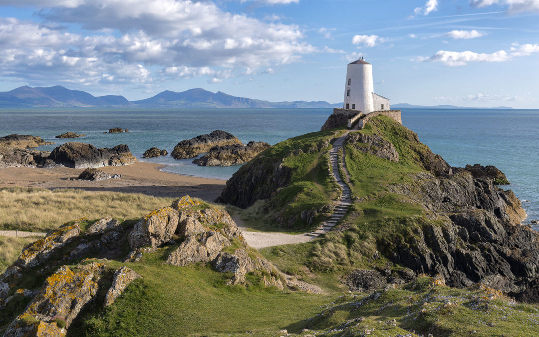
Llanddwyn Island
In the image, I can see a beautiful landscape consisting of grass, rocks, the sea,the cliffs, the sky and a white lighthouse just about in the middle. There are steps leading down from the lighthouse. In the picture, there is a mix of different levelled shapes such as the cliffs and rocks. In the image, a variety of different colour and tone has been used , such as dull green for the grass on the rocks in contrast to the bright blue sky. The photographer has used rule of thirds to make the white lighthouse stand out and catch the viewers attention straight away. The photographer has used different shapes and levels of the cliffs so that it would look better in the background compared to the cliffs in the middle. Unleavened cliffs have been included into the picture deliberately. The lightning for the picture is at a very low aperture as the picture is letting less light in, this js to create a calm softening environment for the viewer. The picture however does not show how fast or slow the shutter speed was as there is no blurry or any crystal clear movement other than a minor wave of the sea in the far distance, suggesting a medium shutter speed like 15/200. In the foreground there is the small rocks clotted up together, in the middle ground there is a lighthouse slightly to the right. To break up. the image also has a mountain in the far distance and a sea in the middle suggesting how precisely and carefully the picture has been taken to impress the viewers. This picture was taken to show beautiful landscapes to many people in the world who are unfortunate to see these things in person or to show off the beauty in different countries or cities. This picture was taken in Anglesey Wales because of the breathtaking landscapes hidden over there. It was easily noticeable that I has been taken recently like in the 21st century because of it's quality and the brightness of it's colour.The weather may also suggest that the picture was taken in the 21st century as it looks windy but also sunny. It connect to my work because it's a type of picture I had once focused on and attempted to take. This picture can encourage a beginner in photography to consider there aims and objective to what they want to achieve or can motivate a person to do even better and learn something new. I don't think that this image has any hidden meaning behind the work but however it is just showing the different landscapes that exist within our world. I like this picture as it has a good atmosphere and tone to it. It is a very beautiful view to look at look at, however in my opinion the aperture could have been more better to make the picture less brighter.
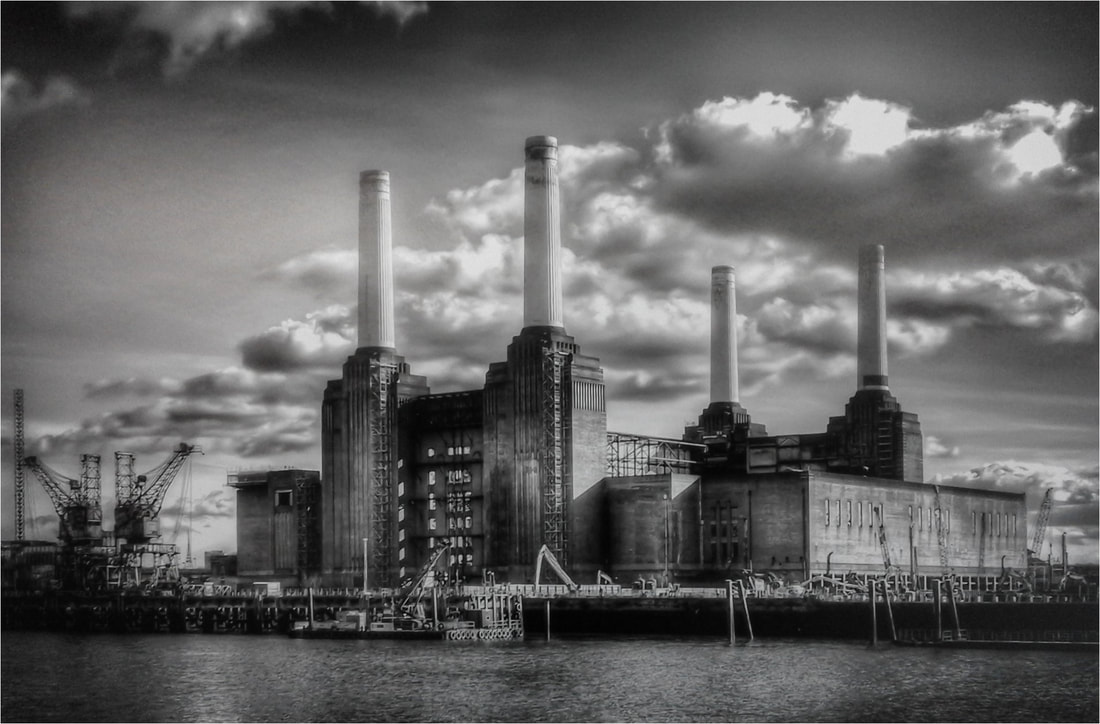
Battersea Power Station
In the image there is a "black and white" complexion throughout the picture and no colour used in the picture. In the far distance I can see power station which are shown to be very heighty and gives off a dark atmosphere. Amongst the tall power stations, I can see cranes which emphasises the terrifying look. The photographer has used minimal colours like mentioned before, only black and white has been used in this image to make it look old and depressing. The power station is in the background instead of the middle ground, this is because it is a big factory. However in the foreground there is a sea which is also in black and white. Monochrome setting has been changed on the camera when taking this picture to create a tension atmosphere for the viewer and make it interesting at the same time. This makes the picture look very dull and completely different to the "Anglesey" picture which is very eye catching and bright compared to this.The clouds look very light and almost unreal. It seems like its about to rain as have noticed the greyish colour contrasting in some clouds. The aperture seems to be low and a high shutter speed must have been used to catch a good picture. This picture was taken in London-In a Battersea Power Station by Andrew Verdie. Although I am not sure why it was taken. I can say that it was probably taken to show different attractions and to show off an interest in photography and show the photographers understanding.This picture looks quite old as this is black and white and it's not something you would ever come across in London often. It doesn't connect to my work directly but it is a landscape and my focus in photography is mainly on landscapes too. I think the way the picture is taken, it shows different black and white contrasts and makes it look quite realistic. Personally, I don't think this image has any hidden or direct meaning behind it but I do like the work and how it is presented. I like the atmosphere and the tone that it gives off to the viewer.
It connects to my work as my work focuses on the landscapes of different parts of the world including all conflict which may cause harm or sadness. This shows the different ways that a picture can be taken and the different meaning that can go through when looking at this picture. In my opinion I think the image itself shows the meaning and there is no hidden meaning because there is no other meaning that can be implied other than the dark dangers which are causing conflict and harm to the world such as global warming and pollution by these power stations and something must be done to avoid these being used.
It connects to my work as my work focuses on the landscapes of different parts of the world including all conflict which may cause harm or sadness. This shows the different ways that a picture can be taken and the different meaning that can go through when looking at this picture. In my opinion I think the image itself shows the meaning and there is no hidden meaning because there is no other meaning that can be implied other than the dark dangers which are causing conflict and harm to the world such as global warming and pollution by these power stations and something must be done to avoid these being used.
After the boom
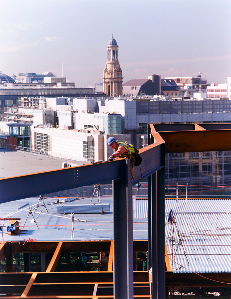
In the picture there is a man working on the construction site on top of a building and behind him is a city filled with different size buildings. This shows us a man who ridged on top of a building risking their life to rebuild Manchester after the "boom" showing us how far people will go to rebuild their city. This shows the unconditional love and kindness people show towards their country, this also shows the respect from a civilian to their country and the way it is treated with such grace and care.
I think this was taken to show a city which has so many buildings yet another building is under construction. This picture is taken in Manchester. I don't think that the photographer has a specific reason to be taking this picture however it could have been taken to explore the different ideas that people may have of the world or also it could be taken to shows the hardworking and effort people put into making their country "the best" but from the practical perspective which suggests that it's not always the easiest to make your country look the best and every country is equal despite poor or rich.The writer purposefully takes this photo from this angle so we get a glimpse of the devastation and the builder wearing bright green to be seen as trying his best to fix up Manchester after a shocking attack. I can see scaffolding scattered around trying to support the buildings as the building is vulnerable to drop. It does not connect to my work directly like it's not related to my theme but it does connect in terms of the basic structure off taking a picture such as composition and white balance. This inspires me because I am able to look at this professional picture and improve my way off taking pictures based on this.
Personally I don't like this picture because it is not something I would not find very intriguing. This is because I like to take or view pictures which are directly meaningful and have a large depth of field such as the pictures from Anglesey. In my opinion these pictures are more successful and more worth full and are given more priority. One strength for this picture would be that its very different and would show a lot of support for Manchester at a hard time when people lost lives and houses after the attack or "boom". However one weakness is that it's very difficult to understand that Manchester is being recreated after an attack as there is no direct visual image to suggest this. I think it should have been improve by adding something which could suggest that Manchester has been attacked and it has been recreated.
Mindmap

Anglesey
In February, I went to Anglesey with school. We decided to go in the winter so that
we could get the beautiful winter atmosphere with the shining sun reflecting on to the ocean.
we could get the beautiful winter atmosphere with the shining sun reflecting on to the ocean.
Beach


Best
I like this picture because everything such as white balance aperture and shutter speed is right and the picture itself is every clear.It also shows different views of Anglesey clearly.
|
Worst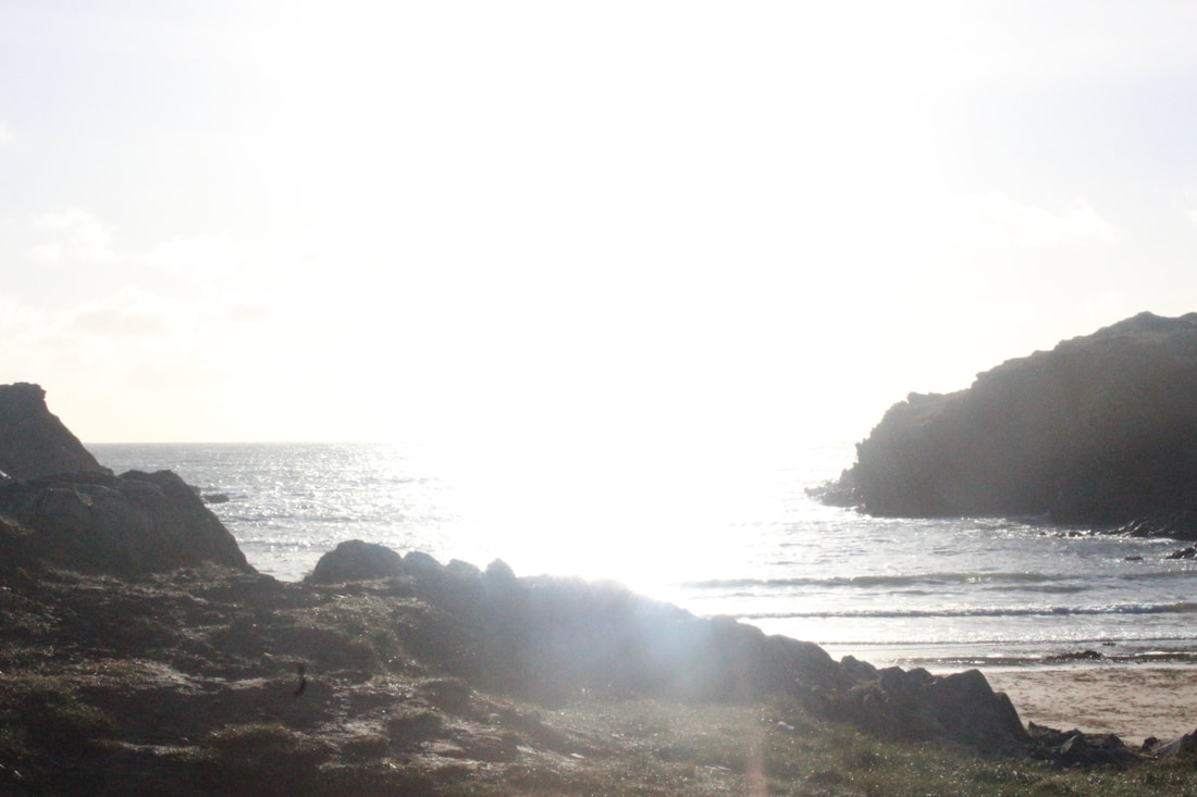
I don't like this picture because the right settings haven't been used and the picture is quite bleached out. This picture wouldn't help me achieve the grades I want.
|
Animals


Best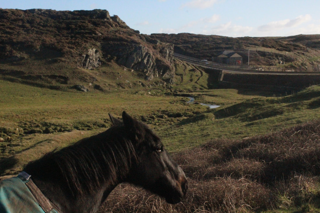
I like this picture because rule of thirds has been used in a very specific way. I like that aswell as the horses head being shown in the picture, the view in the background is quite clear too.
|
Worst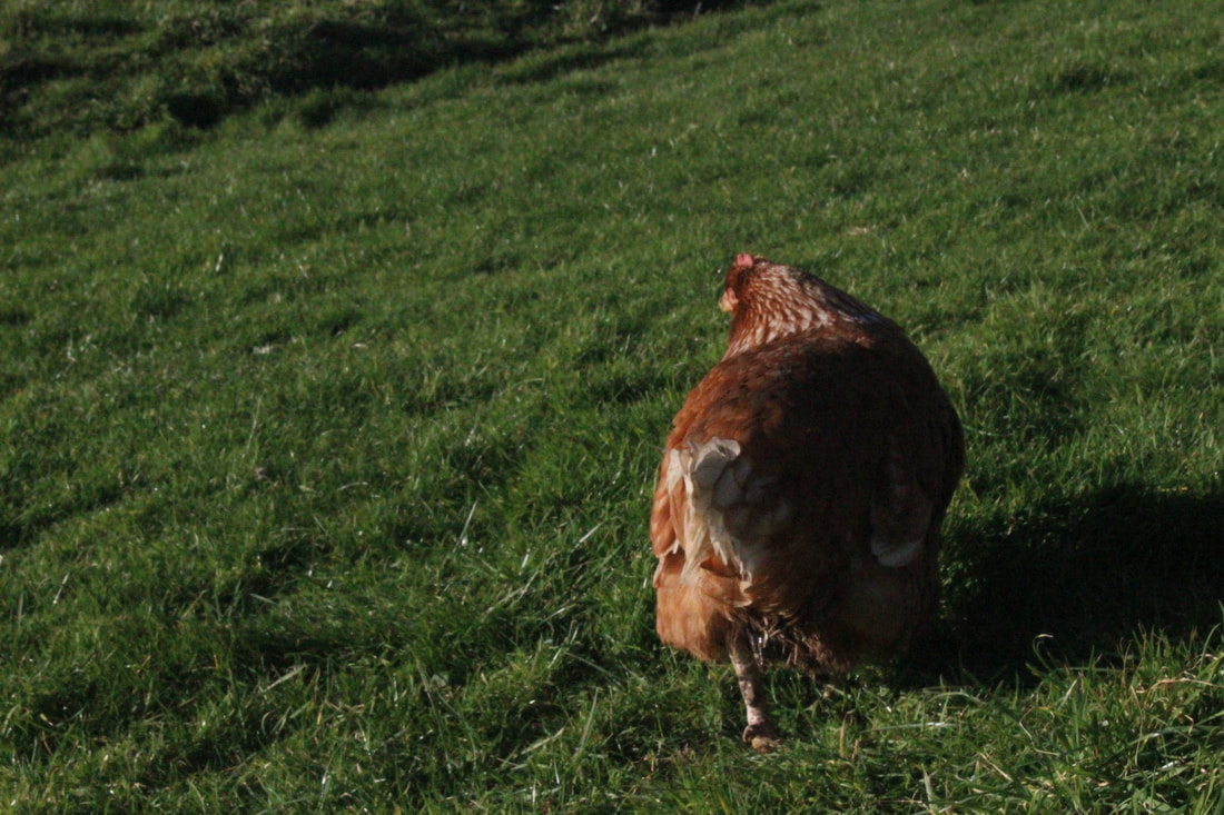
I don't like this picture because the chicken is not facing the camera and I think this image insults my knowledge because it's a very unprofessional picture.
|
People


Best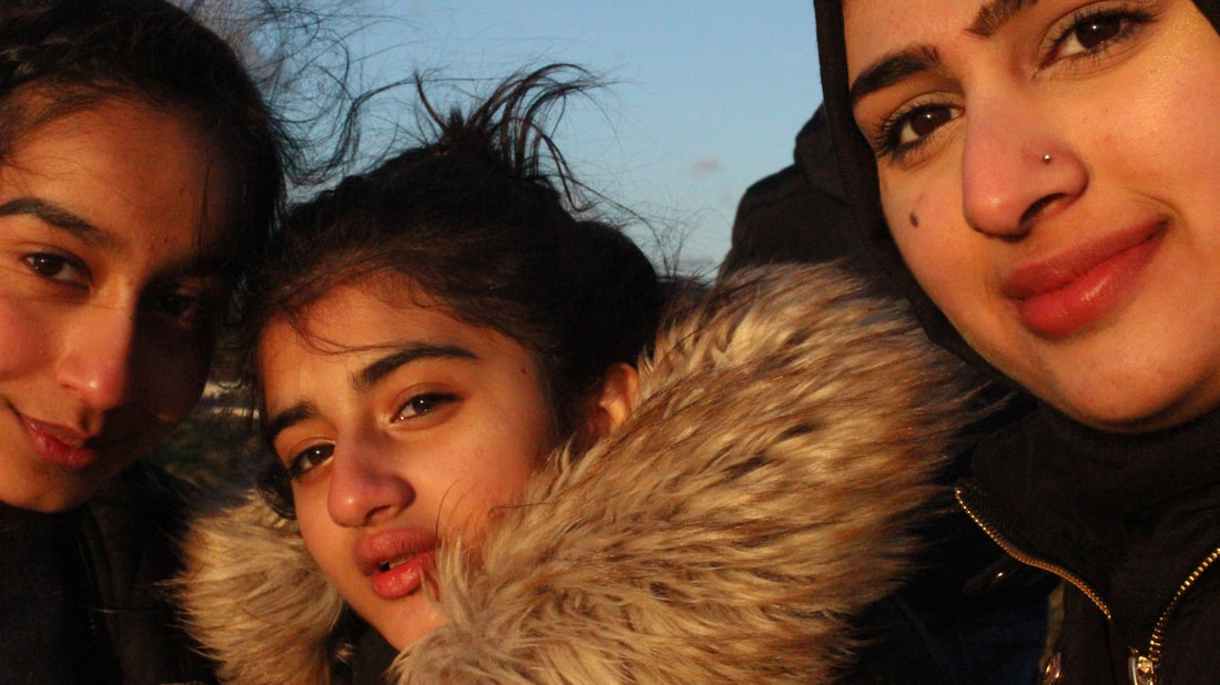
I like this picture because the sun creates another atmosphere of a golden brown colour on our faces.I think that this picture is very different compared to other pictures which are taken.
|
Worst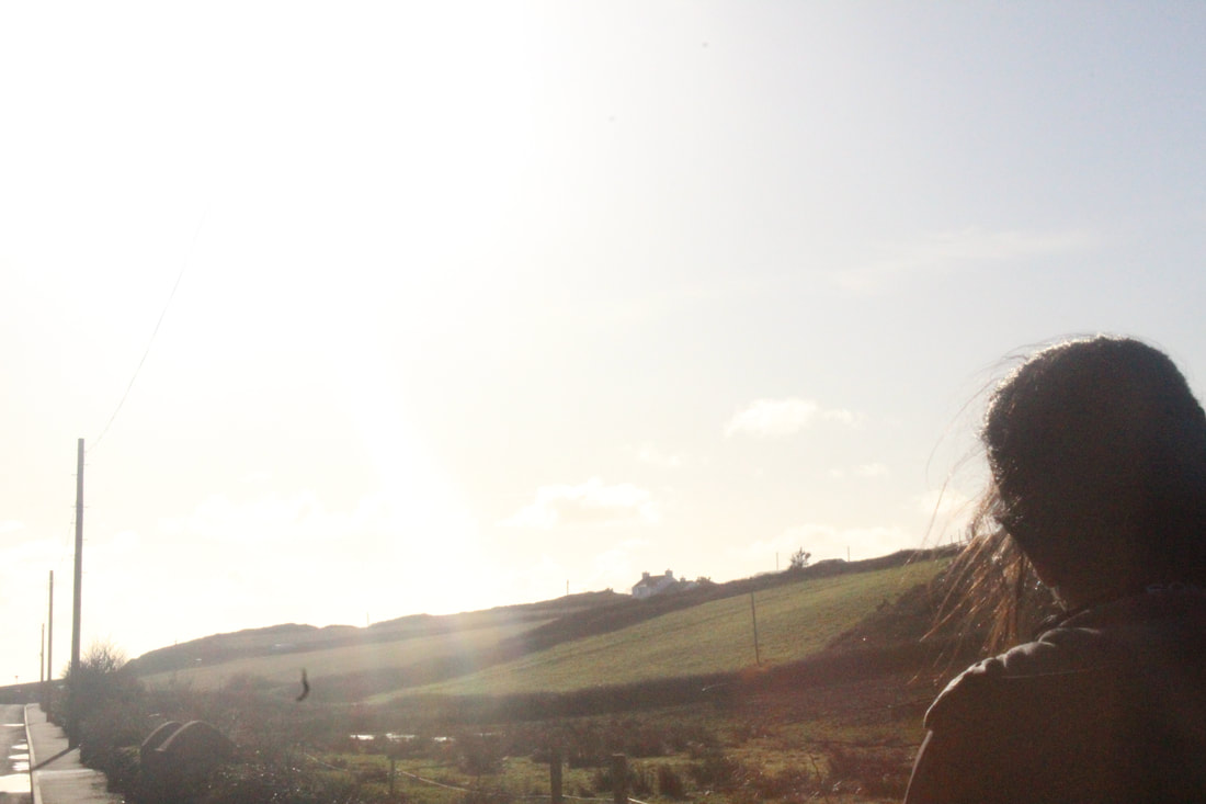
I don't like this picture because its bleached out and it doesn't show anything in the picture nor does it have any meaning to it.
|
Rocks


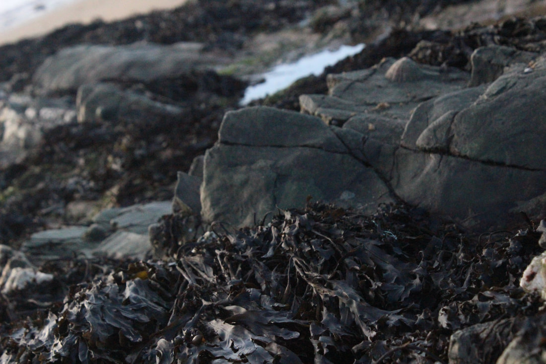


Best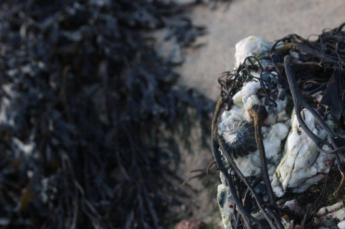
I like this picture because it is focused on only the barnacles and the background is blurred out. I think a good composition has been used.
|
Worst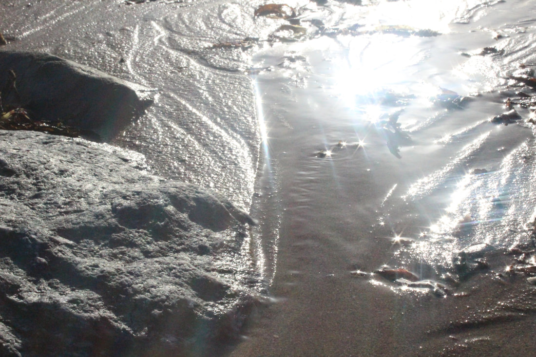
I don't like this picture because again it's very bleached out and I think that it could have been better.
|
Seaweed


Best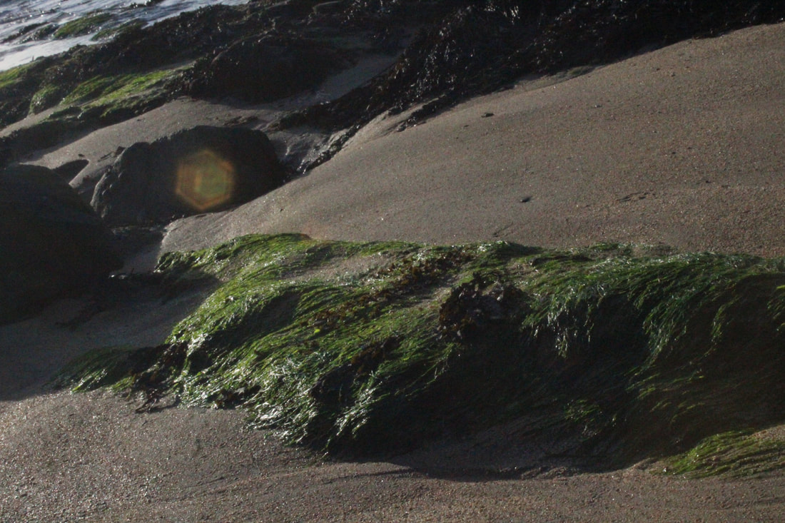
I like this picture because the suns reflection makes the picture look quite professional and clear.It looks very sophisticated.
|
Worst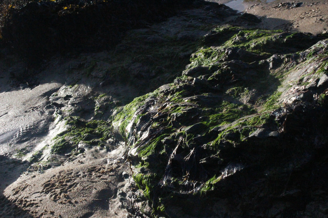
I don't like this pictures because it looks unprofessional and unplanned like as if it was a very randomly taken picture.
|
Sand


Best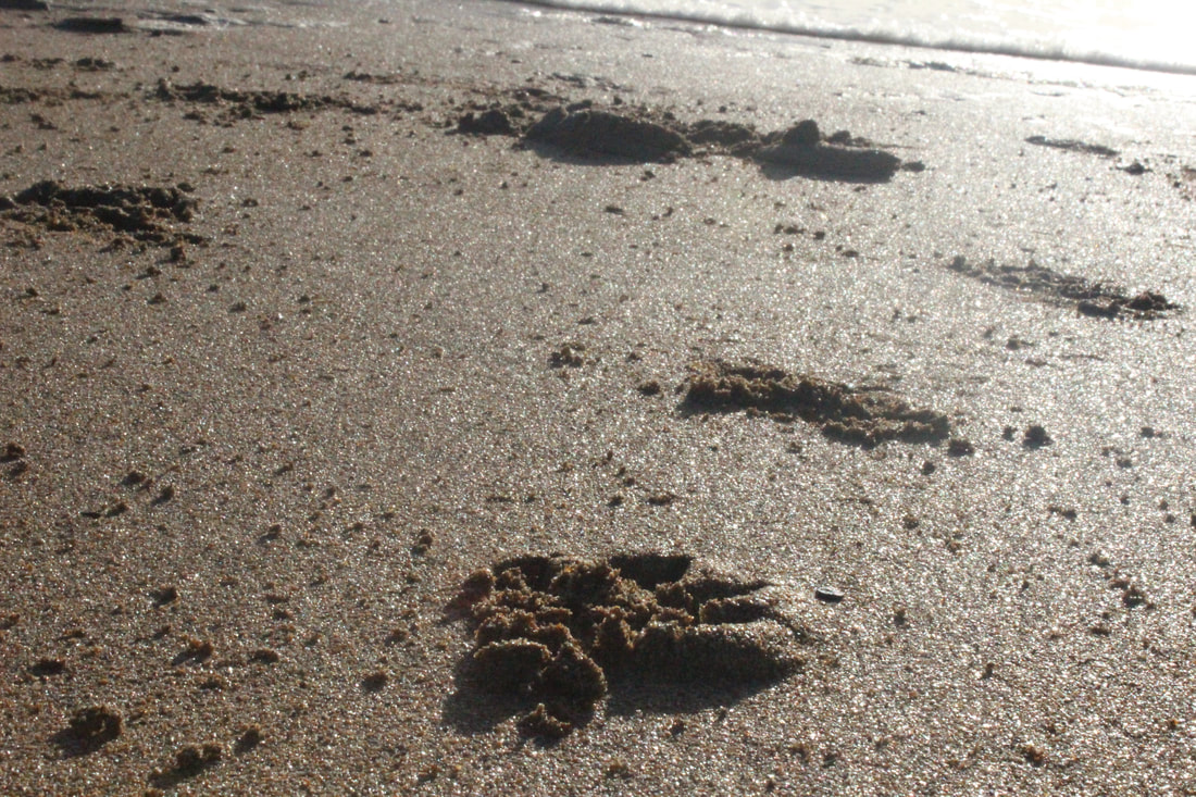
I like this picture because it's very clear like the footprint can be seen very clearly. I think its a good picture because it's not too dark but not too light either.
|
Worst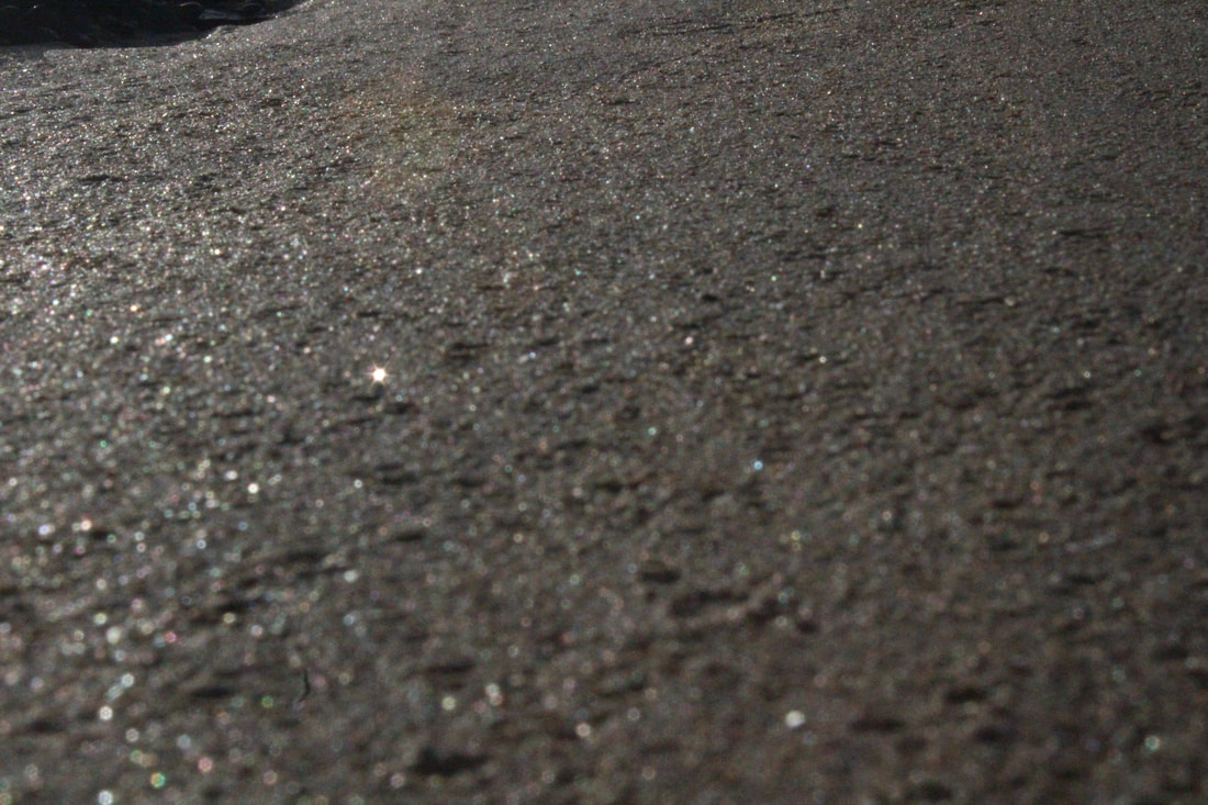
I don't like this picture because it does not have any specific object that it's showing us or there is no meaning behind.I also don't like this because there is no foreground or background focus.
|
Twigs


Best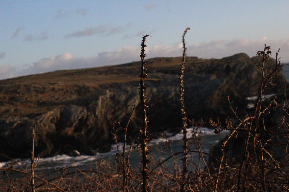
I mostly like this image because of the colour contrast. I think it looks very professional and it makes the image look more planned out.The main focus is on the twigs and the background is blurred out.
|
Worst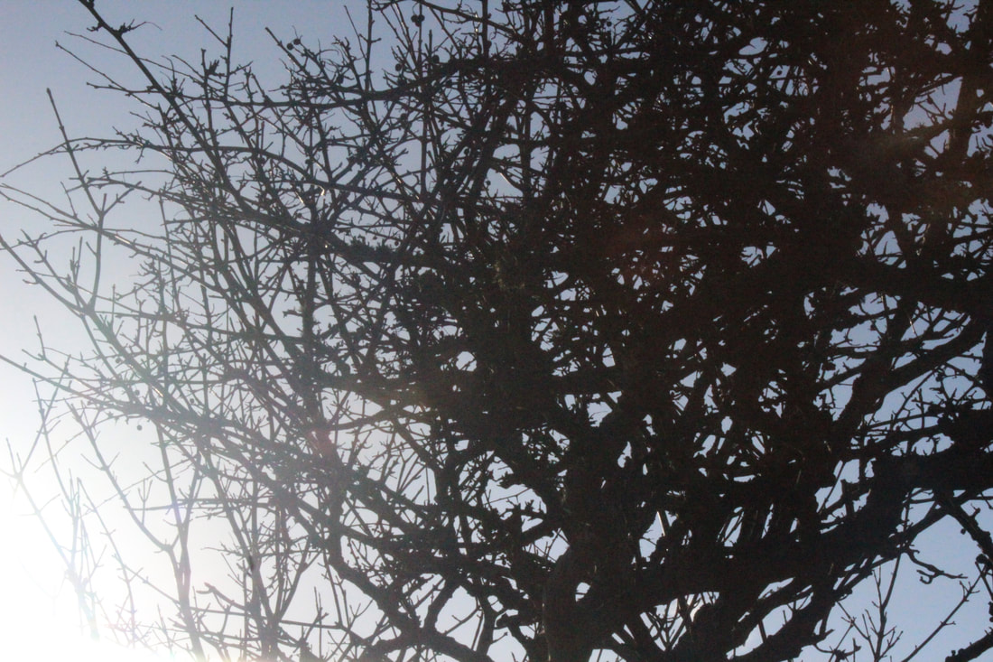
I don't like this image because despite it having something in the center to focus on I still think that's its very unprofessional and unplanned.The tree's branches are all jumbled up and scattered everywhere.
|
Water


Best
I like this picture because the picture has been taken with the perfect shutter speed to capture the right movements of the wave.I think this is a very nice picture.
|
Worst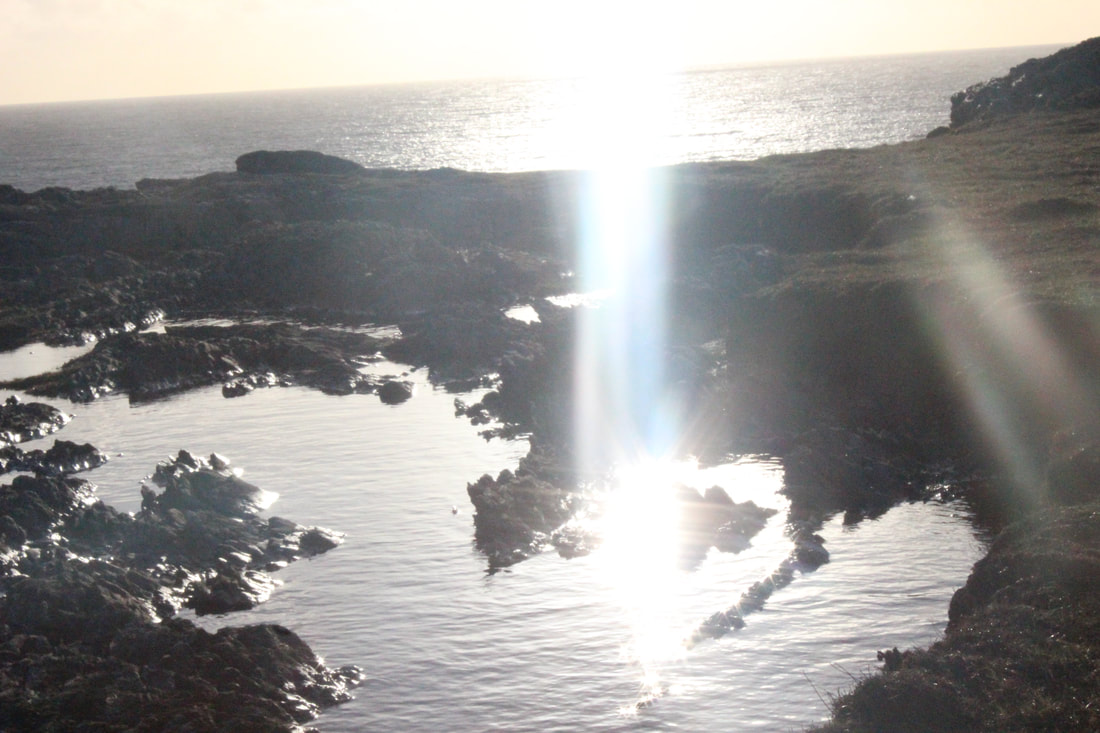
This picture has too much light entering the lens which is why I don't like the picture. I think that this picture is very random and does not fit into any category.
|
Sunsets


Best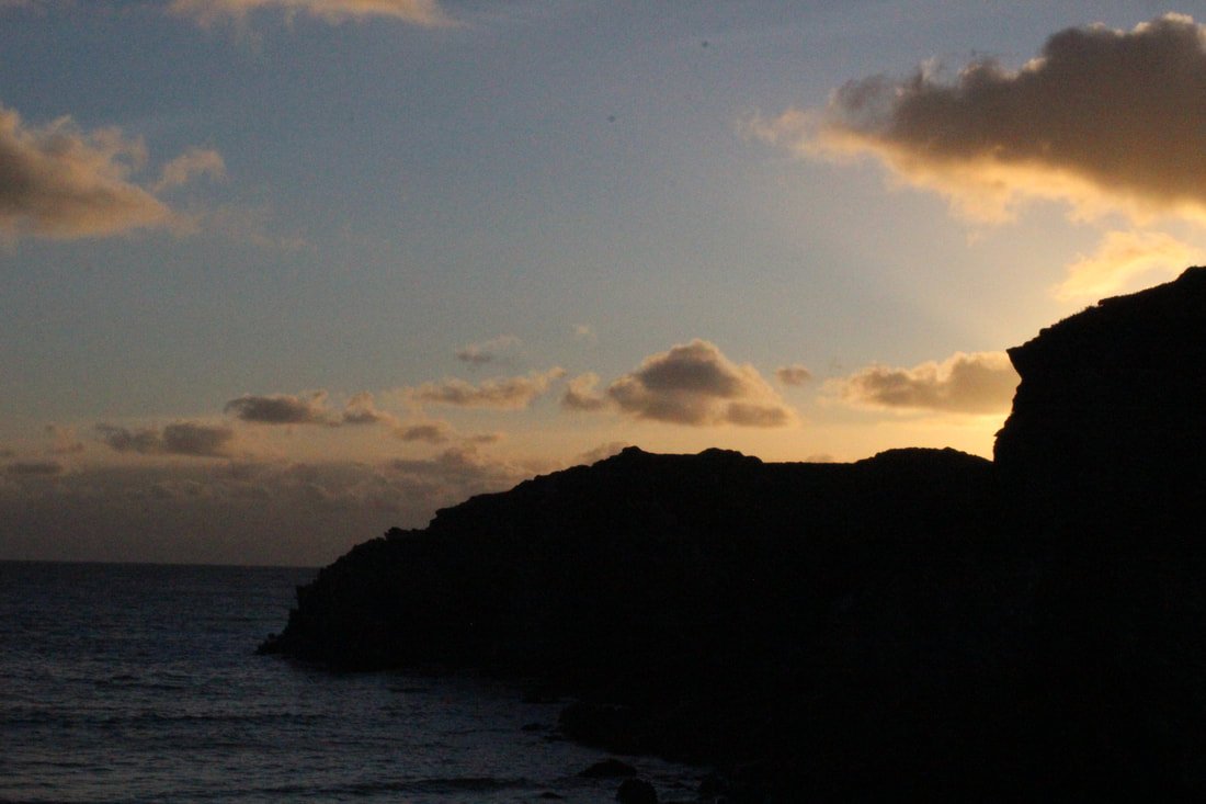
I like this picture because of the beautiful colour contrast between the cliffs and the orange/golden coming from the sunset.I consider this picture as one of my favorites from all of my Anglesey pictures.
|
Worst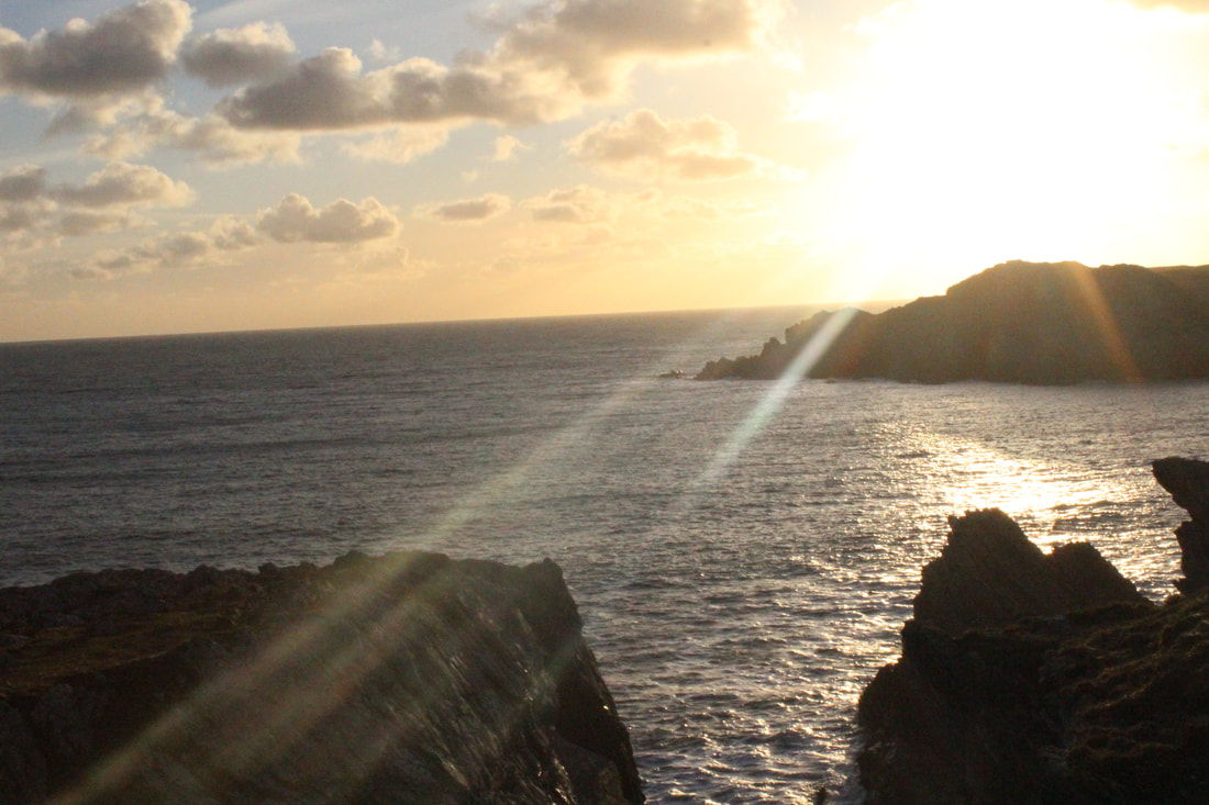
I don't like this picture because I think the light entering the camera lenses is too much and also because this picture is a mix of all the different things in the beach and I would prefer to take pictures separately in order to present them on my page.
|
Forest


Best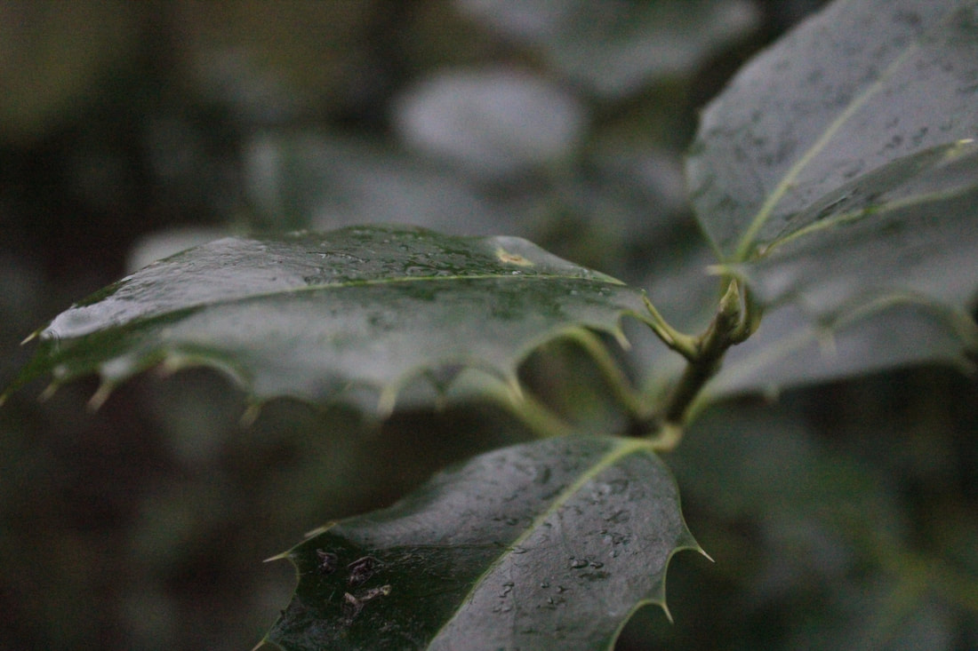
I like the focus of the leaves in this picture. I think it looks very professional and very different.This is different because my images usually focus on the whole of each object but this image shows the image close up and focused.
|
Worst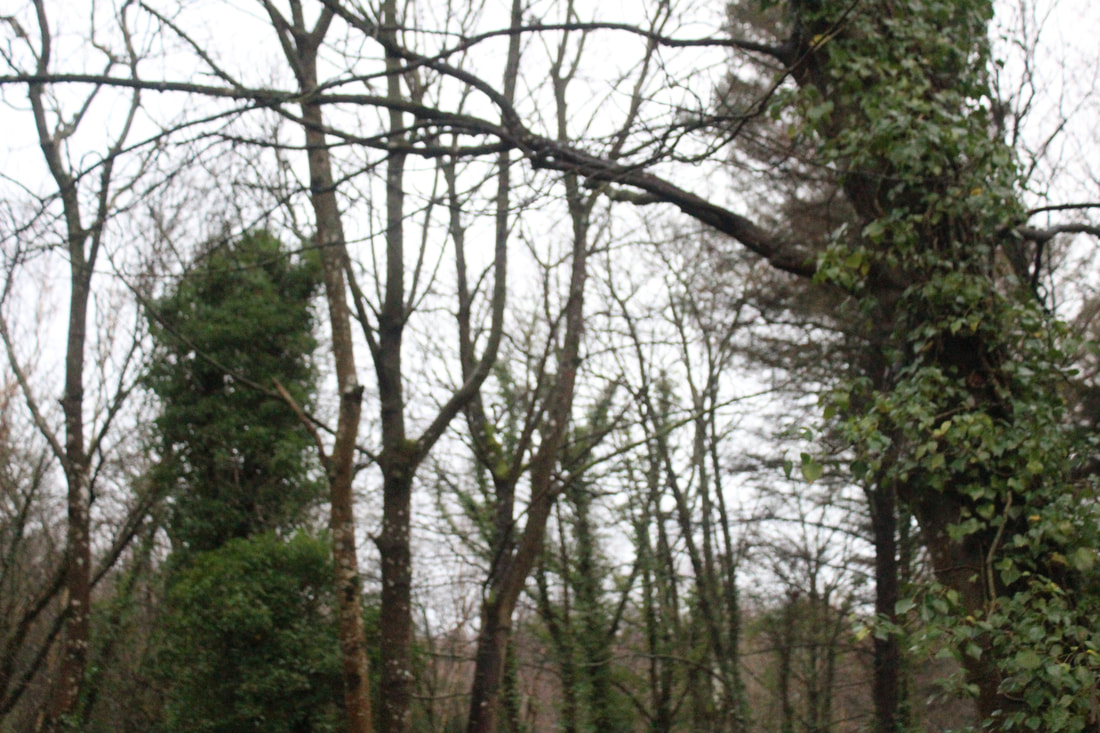
I don't like this picture because again it's very random and it's not very planned or structured very well according to me. I think this picture could have been better by just slightly focusing the camera and taking the picture with the the camera straight.
|
Trees


Best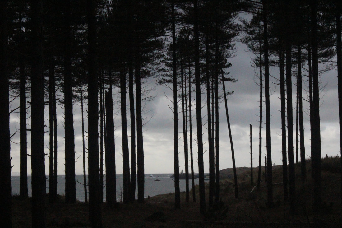
I like this picture a lot because I think it's very well structured all symmetrical and perfectly lined.
|
Worst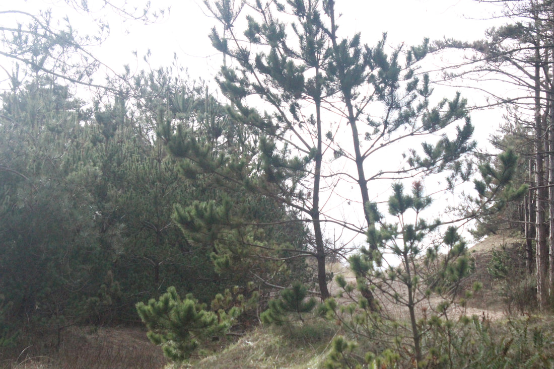
I don't like this picture because it is very random and inappropriate for this category.
|
Ocean/Land


Best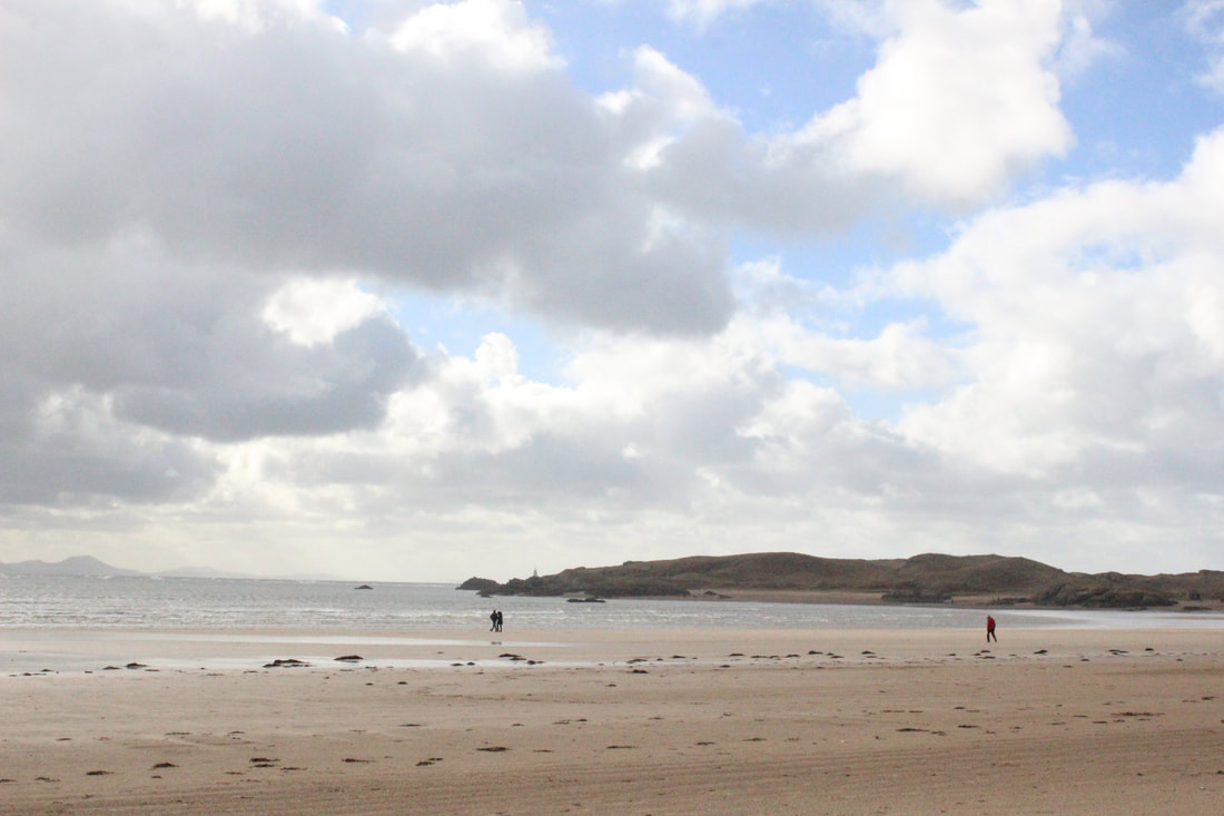
I like this picture because it's perfect for the "ocean" category and it's taken from a good angle where the sky is perfectly contrasting with the sand and the half cliffs showing.
|
Worst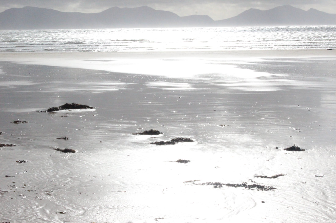
I don't like this image because I think it's very bleached out and it shows absolutely nothing. I think this picture is taken in the "black and white" setting but even excluding that it's still very bleached out.
|
Monuments


Best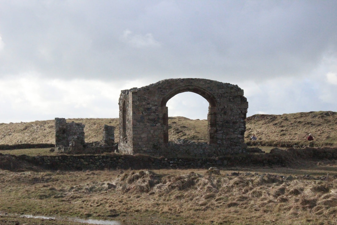
I like this picture because the focus is directly on the monument and part of the land is showing. This picture shows the surrounding as well as the monument itself which makes it looks even better.
|
Worst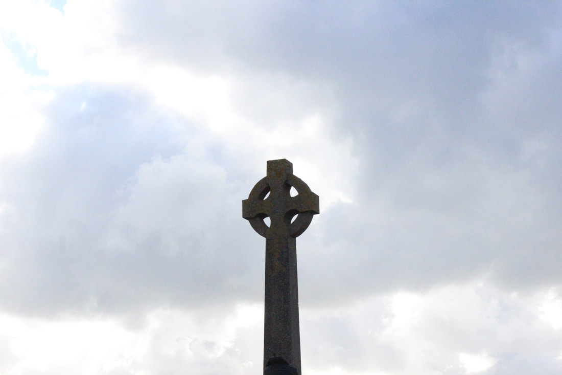
This picture is very random and it's just a monument directly in the middle and I think there should have been some land to show the surroundings of the main focus.
|
Lighthouse


Best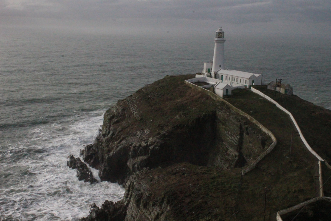
In my opinion this picture was the best for me because it's the perfect angle and height where the picture is not lacking anything but it's showing all the surrounding and enough ocean for the writer to see the location.
|
Worst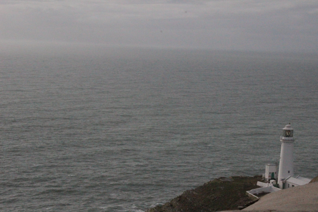
This image is very limited compared to the other ones and that is why I chose this one to be my "worst" image. The lighthouse in this image is quite crowded in the corner and the ocean is too exposing. The main focus should have been the lighthouse.
|
Top 8


Anglesey Photoshop
Photoshop 1
For this Photoshop, I was inspired by Stephanie Jung and Leegan Rooster which motivated me to use the layers and use different shapes on top of the layers.


Photoshop 2
For this Photoshop, I was inspired by Idris Khan by using the layers and moving about the different layers and changing the opacity.


After development:

To develop my image, I explored the different shapes and duplicated them to match my theme and make sure that my picture is fitting in the theme of my photo shops. I also played around the different shapes and rotated them as well as duplicating them and added them to different parts of my picture.
Photoshop 3
For this Photoshop, I was inspired by Leegan Rooster to play around with the different shapes and sizes.


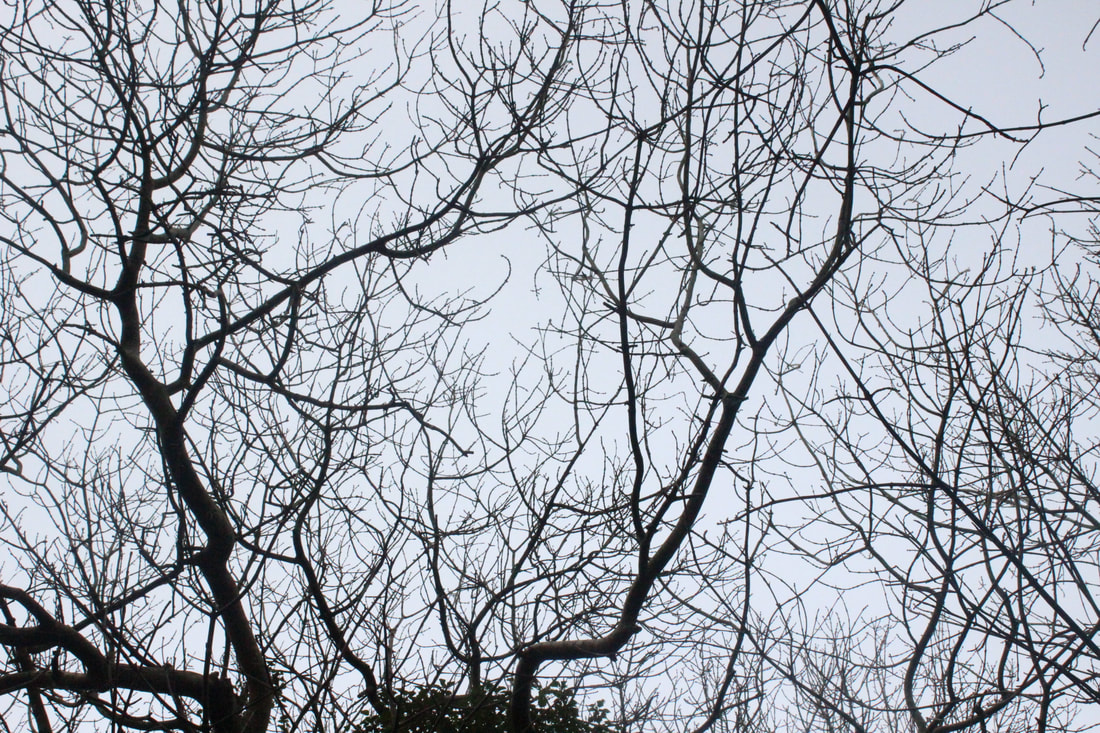
Snowy Landscapes
In the winter, I was giving the chance to go through the snow
and take pictures to convey the weather
and take pictures to convey the weather
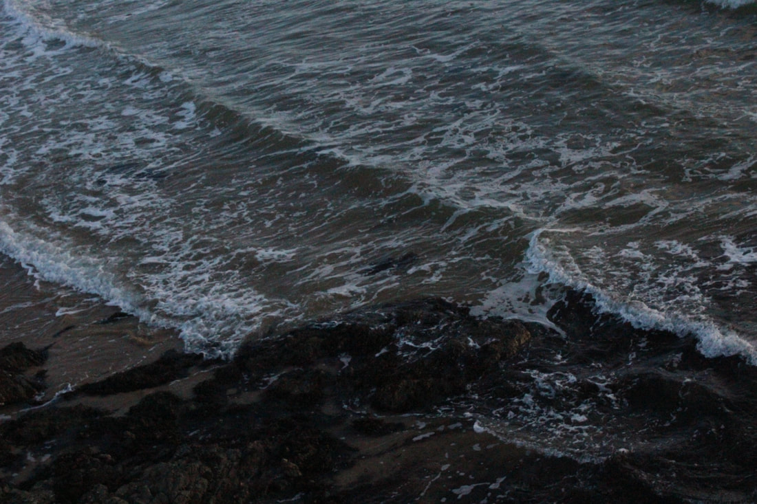
Landscape


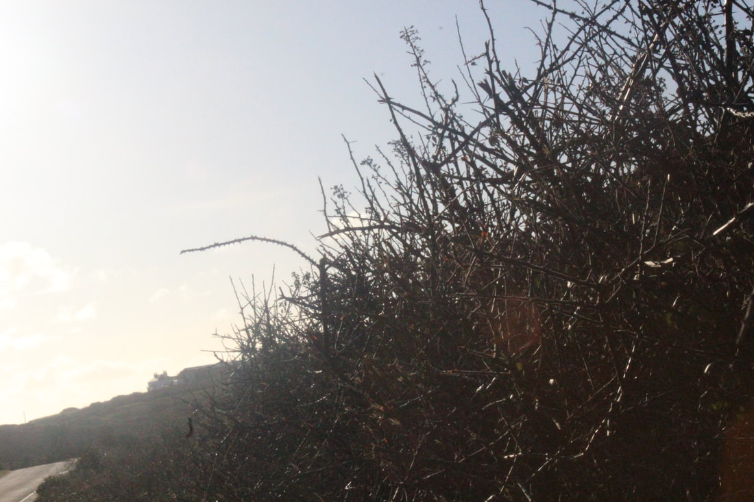
Branches & Trees


Plants


Linking paragraph
I went to Anglesey,Holy Island to capture some of the breathtaking views for my portfolio whereas in the summer I went to London to get pictures of the sunlight reflecting on the beautiful landscapes and churches.In London I had to change the setting of my camera to manual because of the sun and I had to change the shutter speed and aperture quite a few times to make sure my images are coming out correctly.However in Anglesey it was more cold and windy so I had to prepare my camera and take pictures with a higher aperture.
In London my images were focused more on the inside beauty and the central London which concluded in me going indoors to take some pictures at some point, however in Anglesey everything was just in front of me and I didn’t need to go indoors nor was I restricted from such things like taking pictures like we were in a church in London only to respect the religion and their privacy.
In Anglesey, I had three days to capture memories of different places and despite the fact that we had to visit a new place everyday I wasn't in any rush to move along as we had almost a day for each view and we could take picture nonstop because of the countryside. In Anglesey I wasn't on one straight height lever but instead we were at different heights to capture different lighting for the same view which shows my inspiration for photography.
Overall I liked my Anglesey experience more because there was more time to take pictures and I wasn't in a rush all the time.I also think this because in Anglesey there was more beautiful landscapes and more variety of different things.Personally I prefer the country over the city because in the country such as Holy Island in Anglesey it is more adventurous and practical whereas in the city I would need to go through a long process just to go into a place that is worth taking picture and sometime taking photo may be restricted.
Year 11 Mock Exam

Tim Peake-London from Space.
In this picture I can see all the lights in all of London showing from space. It also shows how big and busy London can be. This suggests that London would be a big area of the United Kingdom considering that it looks very busy. The different streams are showing in a darker colour because the building and architecture is lighted up whereas the roads and pathways are duller compared to the rest. The darker streams can also be a river such as the thicker line in the middle ground of the picture. The fact that this line is thicker and move bigger than the rest of the ones makes me think that it's a river that is most famous and which travels around the whole of London such as River Thames. In this picture I can see different shades of lighting such as in the outer parts of the picture, it is quite duller and in the middle ground it is much brighter and crowded. This is because the middle part would be the busiest part as it's Central London.
When I first look at the image I see the thick black stream transforming into smaller ones. Suggesting to me that this would be a famous river. I think the photographer has purposely taken the picture so it's got the thicker stream in the middle ground so that it could lead onto other streams and a person viewing the picture could understand the different pathways of this place. The image has been taken from up above like space so that all of London could be shown as a big area which it is. I think the lighting has been kept natural purposely to show the popularity of London however in terms of the white balance, it could have been brighter which could mean that the photographer was exaggerating when showing the popularity of London by showing it's colour more in depth. For composition, the middle ground shows Central London in the centre which is why the photographer has done this. So Central London would be in the centre to shows London the same way from a images perspective like it is in real life. For aperture the photographer has deliberately kept everything natural because it shows London off as a beautiful natural city. In my opinion the photographer has taken a lot of effort and time to take this image perfectly to make sure there is nothing wrong and everything is in place.
This image was taken from space because it has been taken from a really tall height it almost makes it impossible for it to be taken on a building or a high monument. I think this picture was to show London a busy city as a whole and to show that there are so many people in the world as well as so many different countries where people can settle but London is included in the many other countries that don't sleep. I think this is a perfect way to describe the beautiful atmosphere of London as a never ending city- describing that the city never stops. This means that everything is fast paced and continuously speeding up. This image can also suggest London's atmosphere to a lot of people who are considering to live over there. The photographer could have had many reason for taking this picture such as it could have just been a good way for him to start of his career or he could have a meaning behind it which may be to explore different places and show the difference in quiet cities and busy cities as a whole. This image was taken in 2016 by Major Timothy Nigel Peake who is a Former International Space Station crew member. This also shows as to why this image maybe be taken from Peake.
It connects to my work because it shows different perspectives of the world from all angles. In fact this picture has inspired me to explore the different angles that a picture can be taken such as from up above where the city is being shown as a whole. I think this picture is trying to show the different ways of looking at a county or city before judging it as many people tend to judge places, people and objects without physically seeing it. For example if people hear anything negative about a place they would never intend of to going to their certain place unless something or someone changes their thoughts. This is also seen as judging.
I like this picture because as mentioned before I think it shows the different areas of London which may not have been seen before. I think this picture is not as common way taking picture which makes it unique and it's a new way of exploring different types of angles and perspectives. In my opinion there is no hidden but the direct meaning may be that it's a different way of seeing London so it has just been taken for the pleasure.
London
On 6th July, I went to London Euston with my photography class to explore London and some of the breath-taking views.
This concluded in us taking multiple pictures to express the crowded streets and busy buildings of London.
This concluded in us taking multiple pictures to express the crowded streets and busy buildings of London.
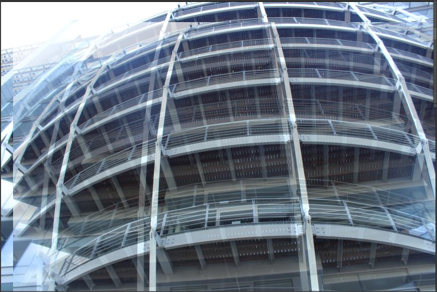
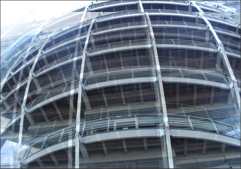
Architecture


Best
I like this picture because I think it sums up London as a "busy" and "crowded" place and I think it's a perfect picture to define London.
|
Worst
I don't like this picture because I think that this is quite useless unless used for photoshop. It docent not show London as this could be a building from any country.
|
|
|
Photo by: Rudolf T

|


In this picture I can see tall Victorian style buildings in a rusty brown colour in broad daylight. I know this because the clouds in the picture look quite fluffy and wide and the sky itself is bright blue. In the picture I can see that the building is old and an antique because of the style and design of the building. This Victorian style building is places in the center of Euston London. The center, foreground and background is the entire building itself and that is why this picture connects to my work because it includes everything that I wanted in my picture.In this picture I think the photography has used low shutter speed to get a sharp picture of the clouds and sky. And a normal average aperture has been used so too much light is not let into the camera lens and it doesn't bleach out the sky. The image has been taken specifically from a certain angle from which the main but some of the back buildings can be seen including the sky.In the picture, it has a contrast of bright blue with a little bit of white and rusty brown for the building and I think the photographer has purposely used this angle to take the picture so it's not a picture taken directly in the center and also so in the picture the we could see the contrast in both colours. I am guessing it was just taken to show different buildings in London Euston and it must have been taken in 20th century as to why the images is focused well and in colour instead of black and white. Personally I don't like this work but I don't hate it either because it does not really show any meanings but then again it's just buildings and they just emphasis different sides of London from all perspectives.
Borough Market


Best
I like this picture because it uses a different composition like the building is taken on the slight right off the centre. I also think that this picture is taken in a different way to other where the camera is placed straight.
|
Worst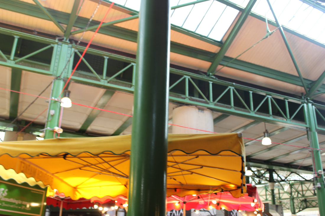
I don't like this picture because it does not show any connections to my work and this picture shows no meaning to my theme or structure of work.I think that this picture would need to be improved by having a focus.
|
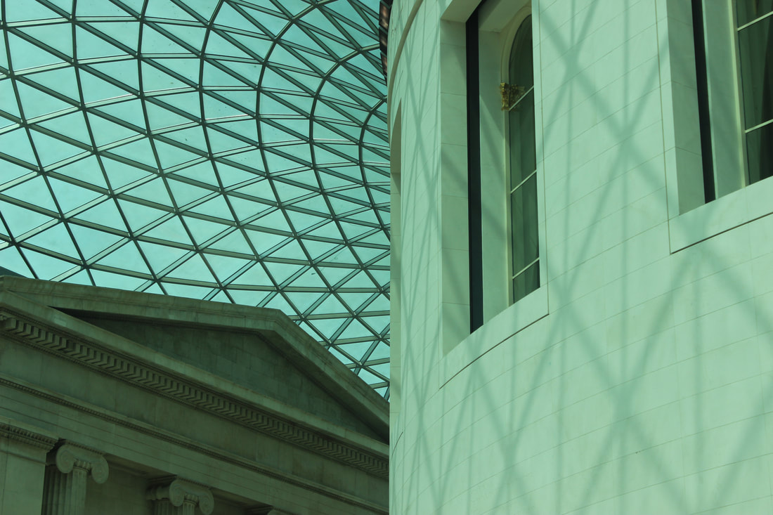
British Museum


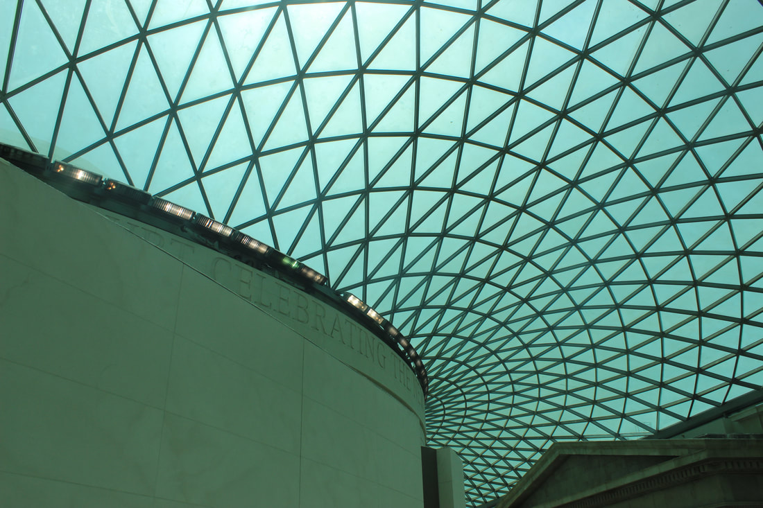


Best
I like this picture because I think the colour contrasts is amazing and it just shows the glass roof very well. I also think that this picture is very different because it's showing part of the building too as well as the glass ceiling.
|
Worst
I don't like this picture because I think it's very limited and it only focuses on the corner of a picture.
|
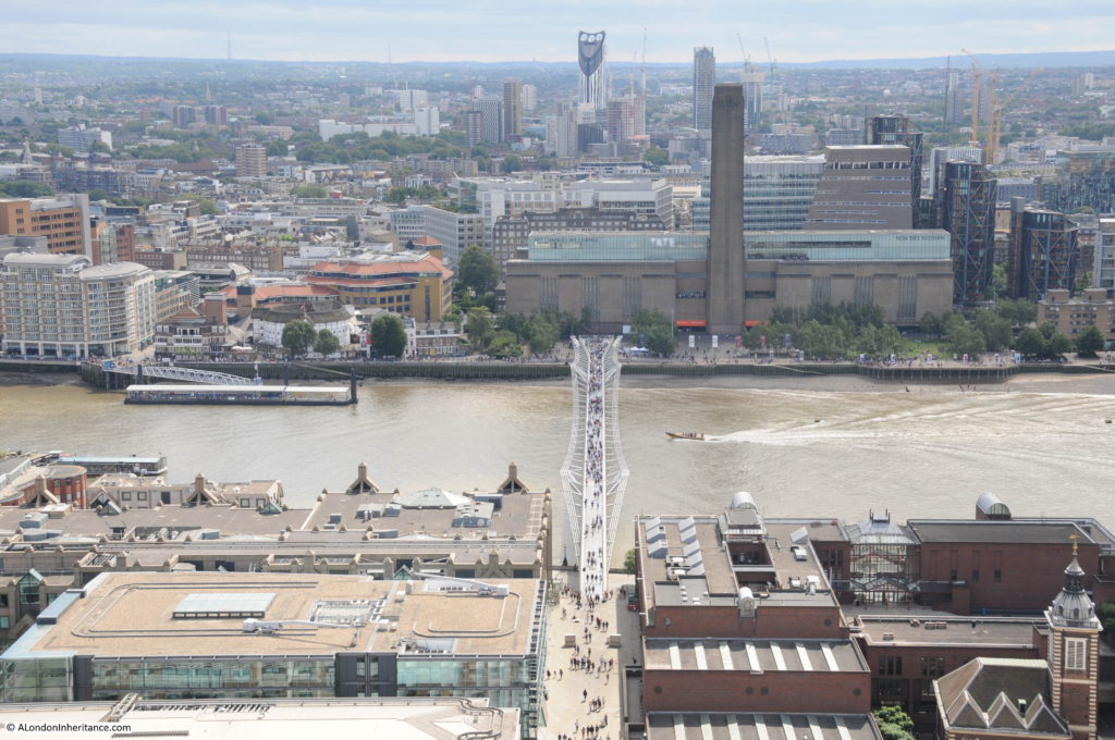
Millennium Bridge


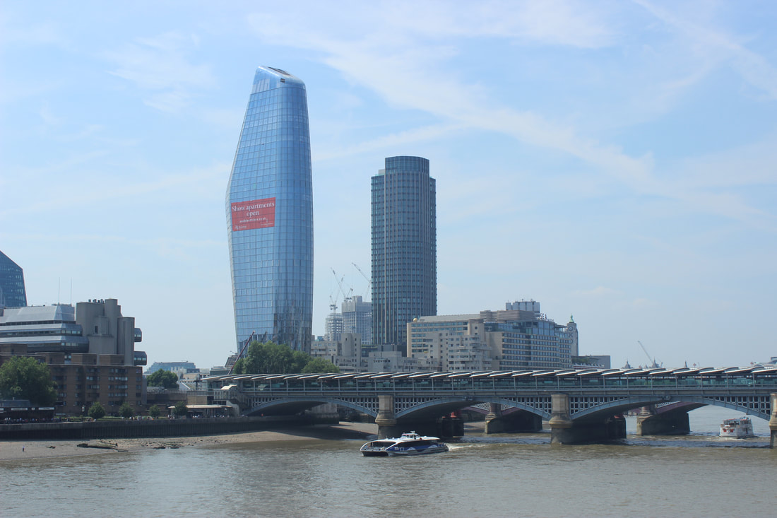


Best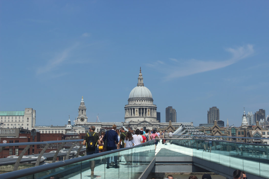
I like this because it shows how big central London is and the composition looks very nice. The St Paul's Cathedral is slightly in the middle of the picture with the bridge facing in that direction.
|
Worst
I don't like this picture because I feel like it does not show anything and it's very limited compared to others. I think this picture can be improved by taking it from a different angle.
|
|
|
Photo by: Katie

|


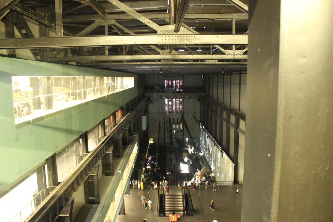
Modern Tate


Best
I like this picture because the light is reflecting into the camera whereas the rest of the picture is all dim. I think that this picture is different.
|
Worst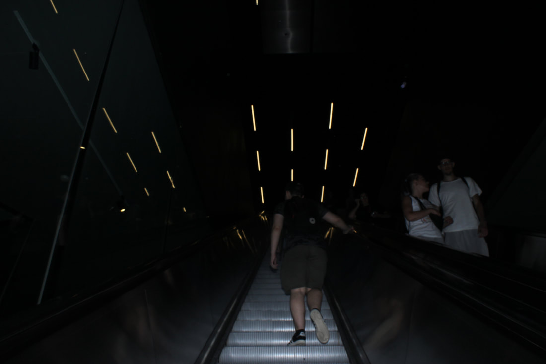
I don't like this picture because I feel like this picture is very dark and less exposed. And also the people in the picture make it look very less professional.
|
|
|
Photo by: Kenneth Powell

|


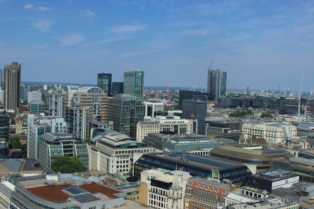
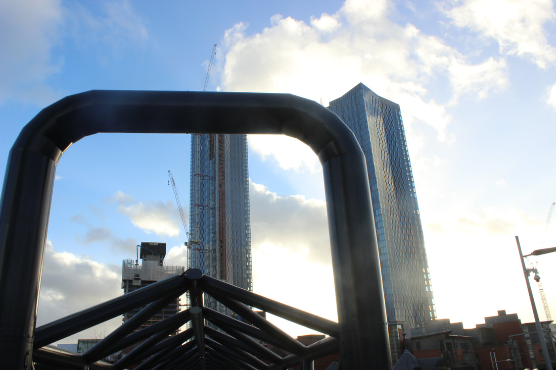
Skyline


Best
I like this picture because I think it has a number of different shapes and designs to show the contrast which make the picture very different and distictive
|
Worst
This picture is very boring as there is no centre point to look at. I think this picture could have been better if it was taken from a slightly higher angle so something else other than just the brick wall could be seen.
|
|
|
Photo by: Stewart Marsden

Photo by: Stewart Marsden
|


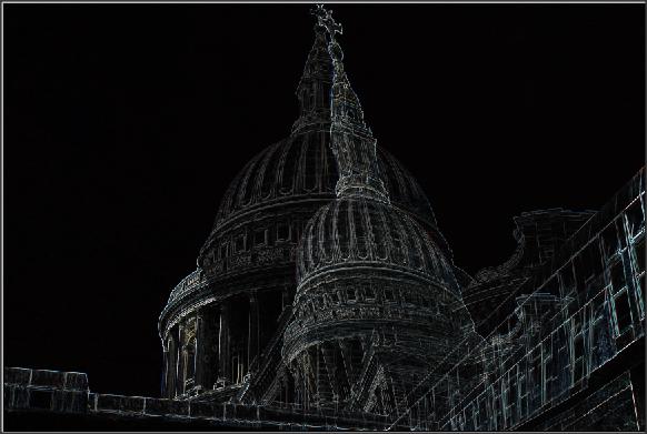
St Paul's Cathedral


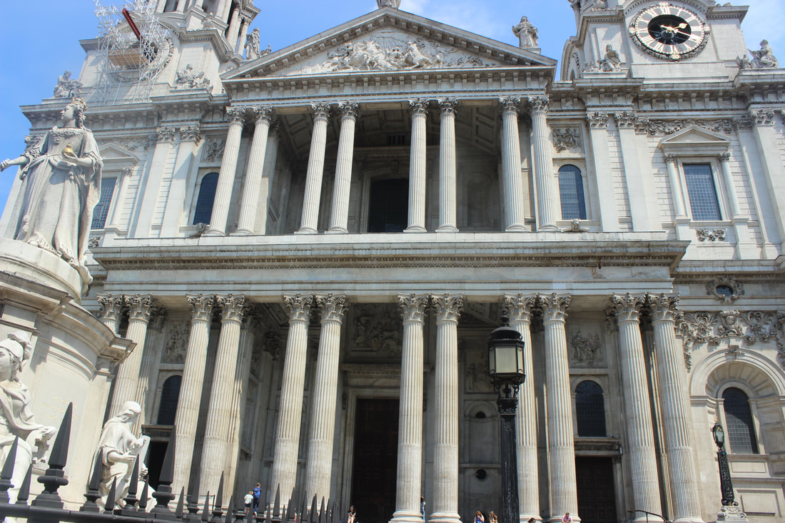


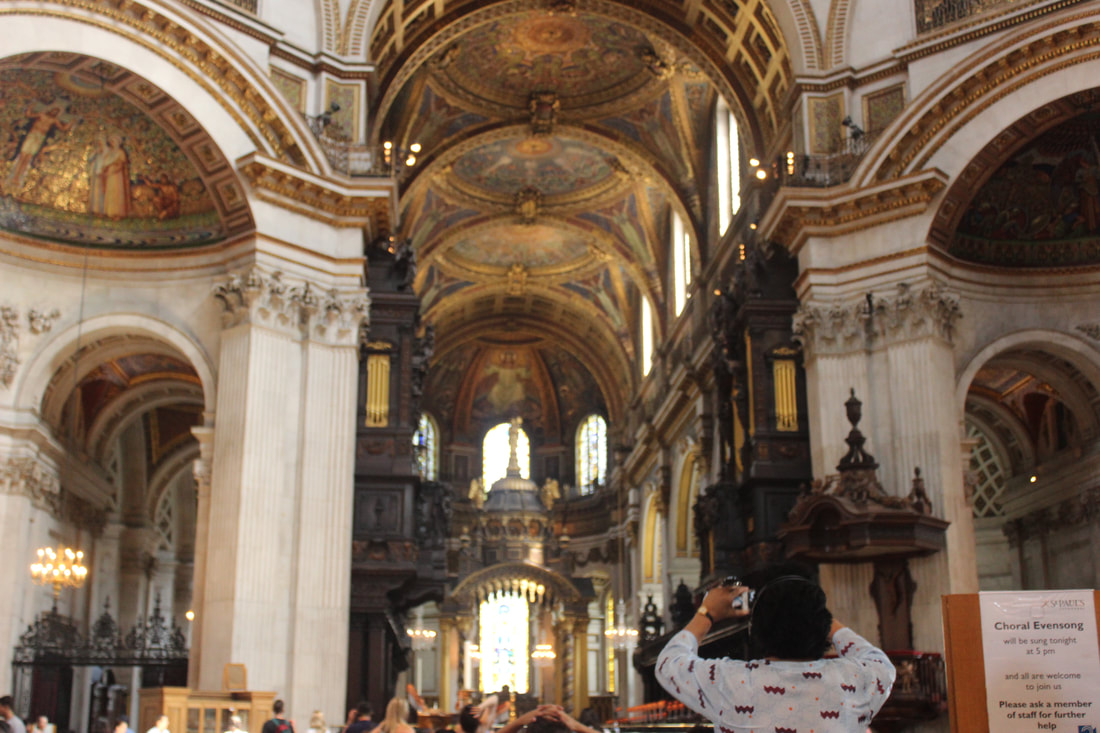


Best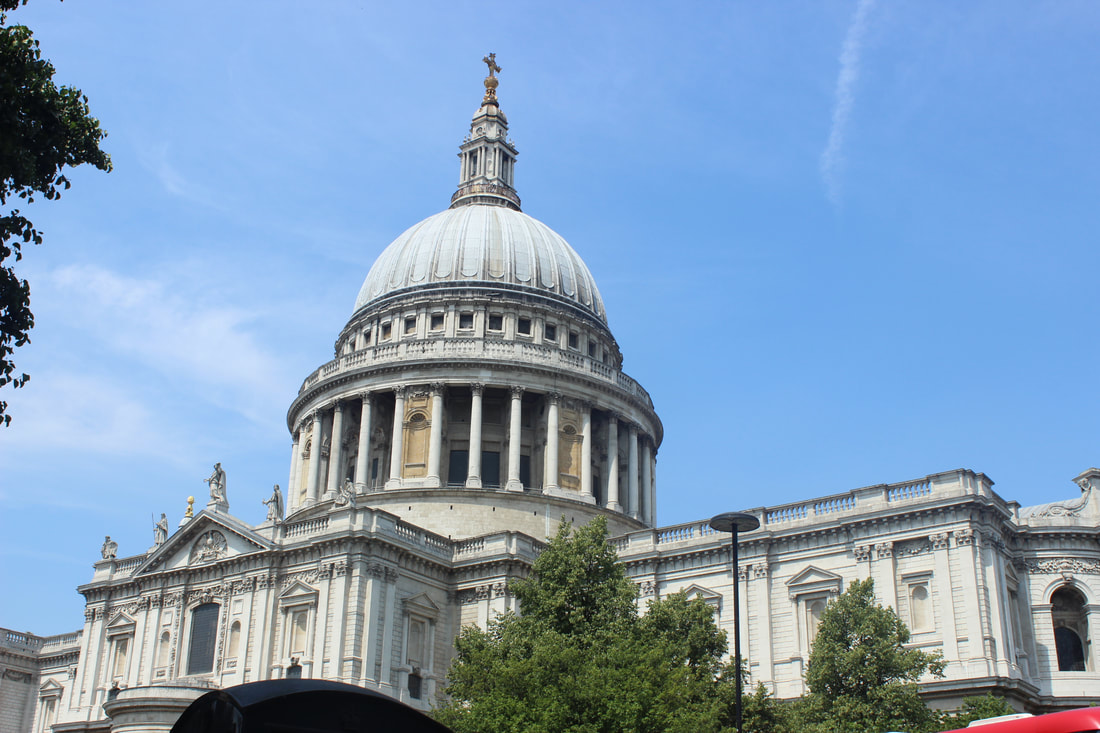
I like this picture because I think that it's taken at the perfect angel like slightly tilted and with the perfect composition.
|
Worst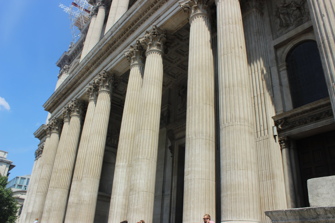
I don't like this picture because I think this is irrelevant and useless. I don't think that this picture could be used for Photoshop either as it isn't straight.
|
|
|
Photo by: Adrian Welch

|


Street Scene


Best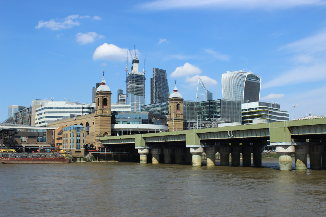
I like this picture because I think this also sums up London as a whole. It describes the crowded building and busy London including the River Thames.
|
Worst
I don't like this picture because the picture is quite bleached out from the bottom otherwise this picture wouldn't have been that bad.
|
Transport


Best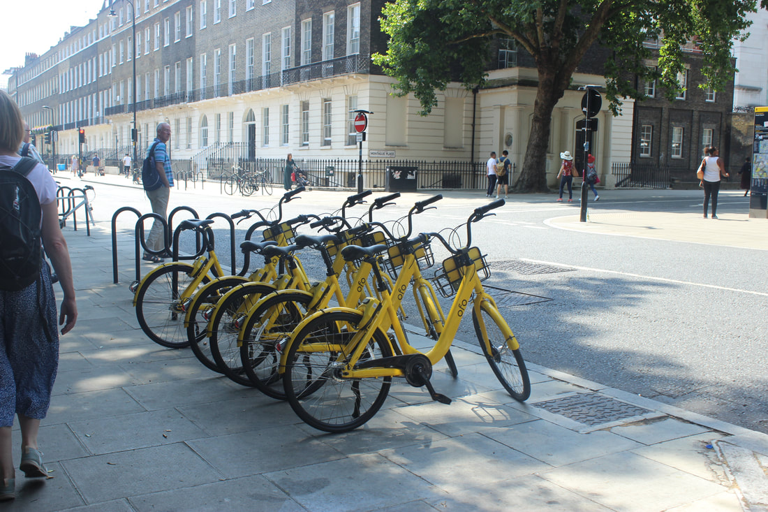
I like this picture because it shows the different types of transport that are available in London such as bikes to ride on or there is a open space for pedestrians.
|
Worst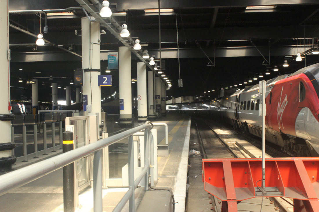
I don't like this picture because it does not suggest anything other then part of a train station.
|
|
|
Photo by: Matt Badenoch

|


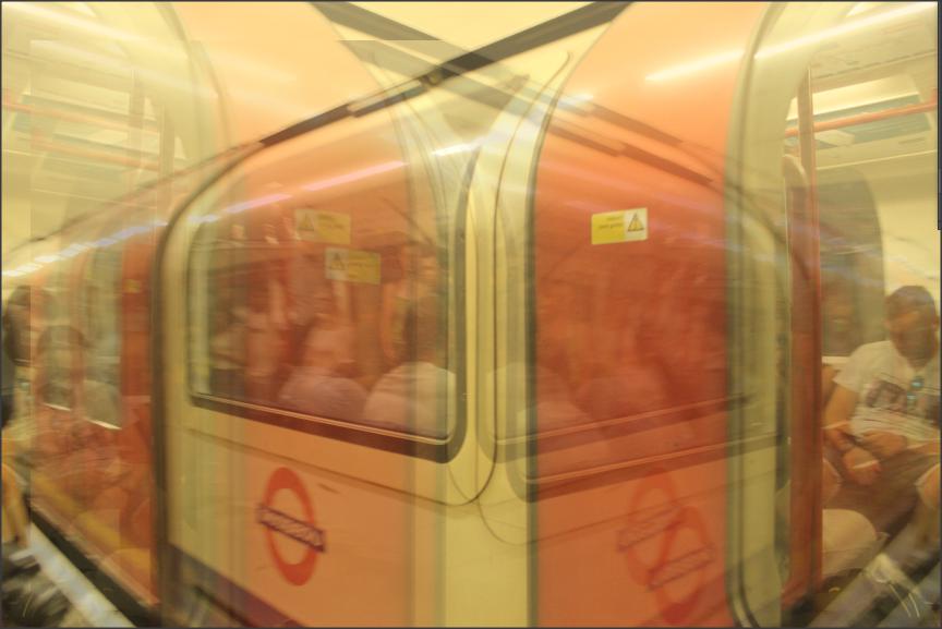
Underground


Best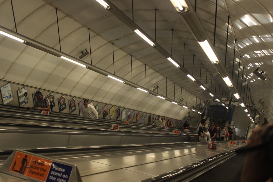
I like this picture because I feel like it defines London as a whole because of the long escalators on the undergrounds and the crowded area.
|
Worst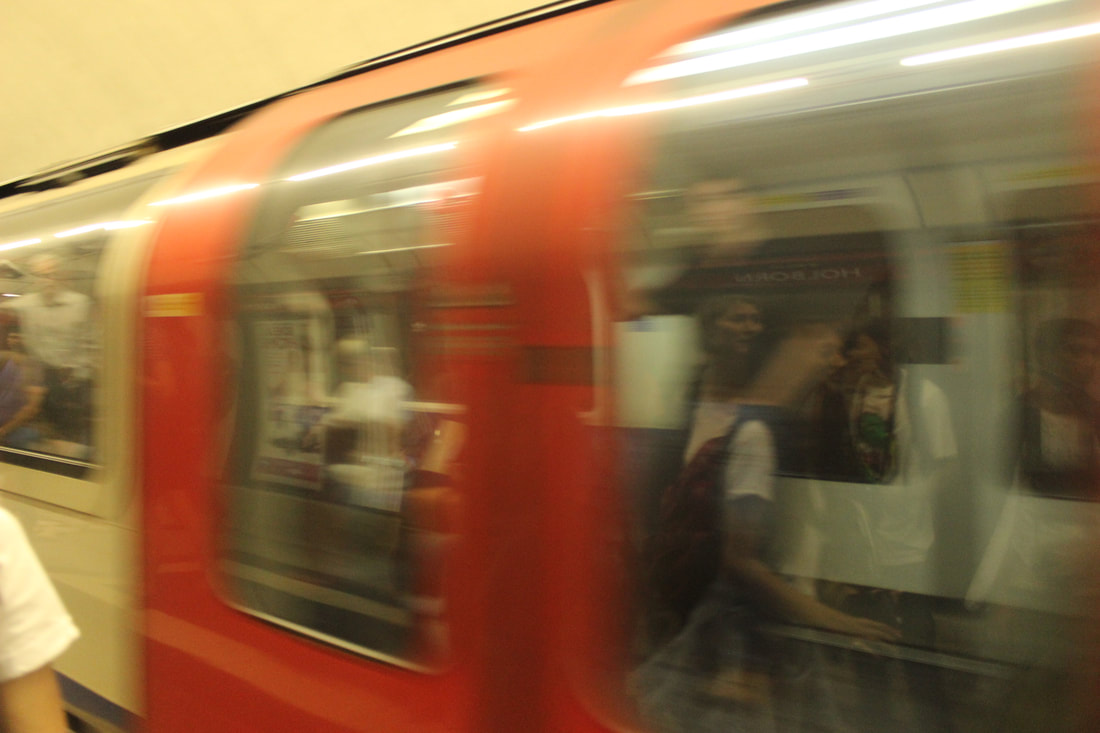
I don't this picture because the shutter speed is not right and because of this the train is blurred out in the picture.
|
Top 9


Youtube videos to help develop my work


Photoshop 1
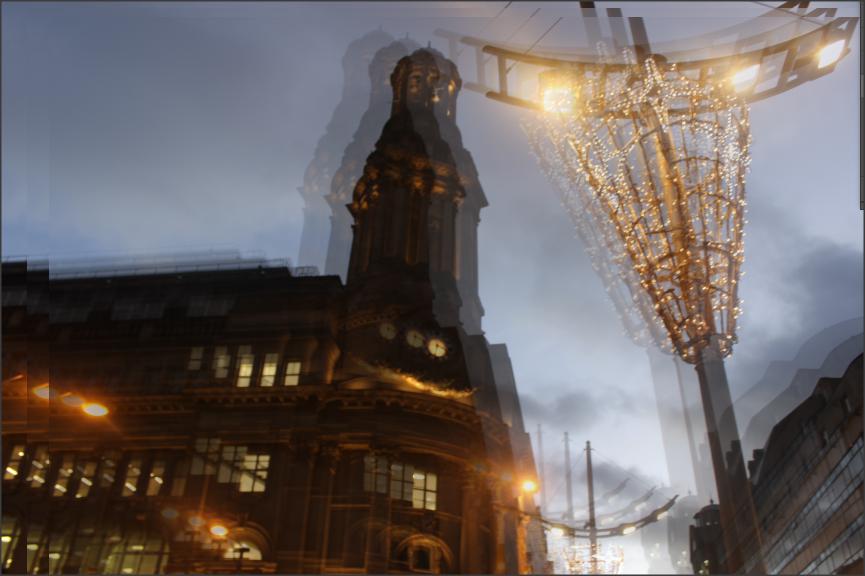
For this Photoshop, I was inspired by Thomas Struth to duplicate the layers and separate them into different colours.


In this image, I used the different shades of blue to grey so I could show the different shades of the same building.
Photoshop 2
For this Photoshop, I was inspired by Berenice Abbott and Debbie Smyth and I used the filter tool to change the opacity and direction of my image.


For this Photoshop, I have used the black filter to conceal the background and I have duplicated the catherdral's dome and placed it at another angle.
Photoshop 3
For this Photoshop, I was inspired by Idris Khan to layer up my image and work around it to make it look unique.


Photoshop 4
For this photo shop, I was inspired by Idris Khan.


Photoshop 5
For this photo shop, I was inspired by Thomas Struth.


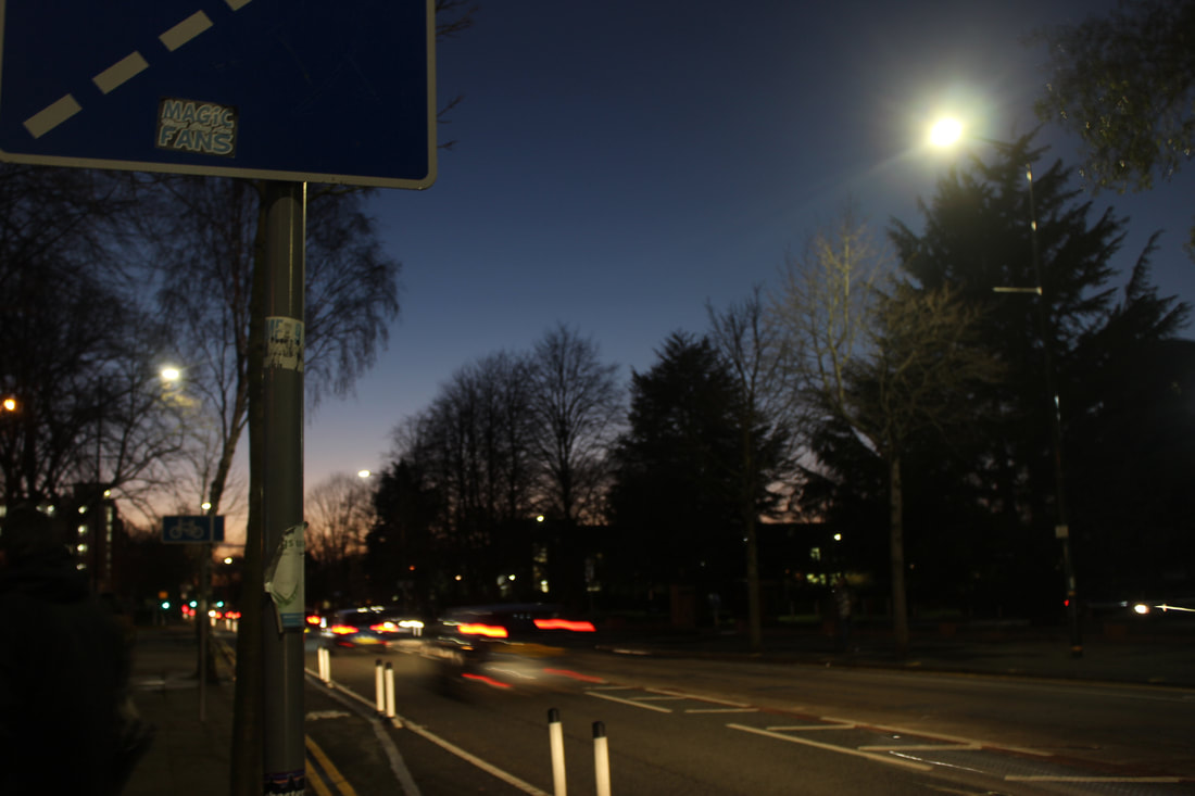
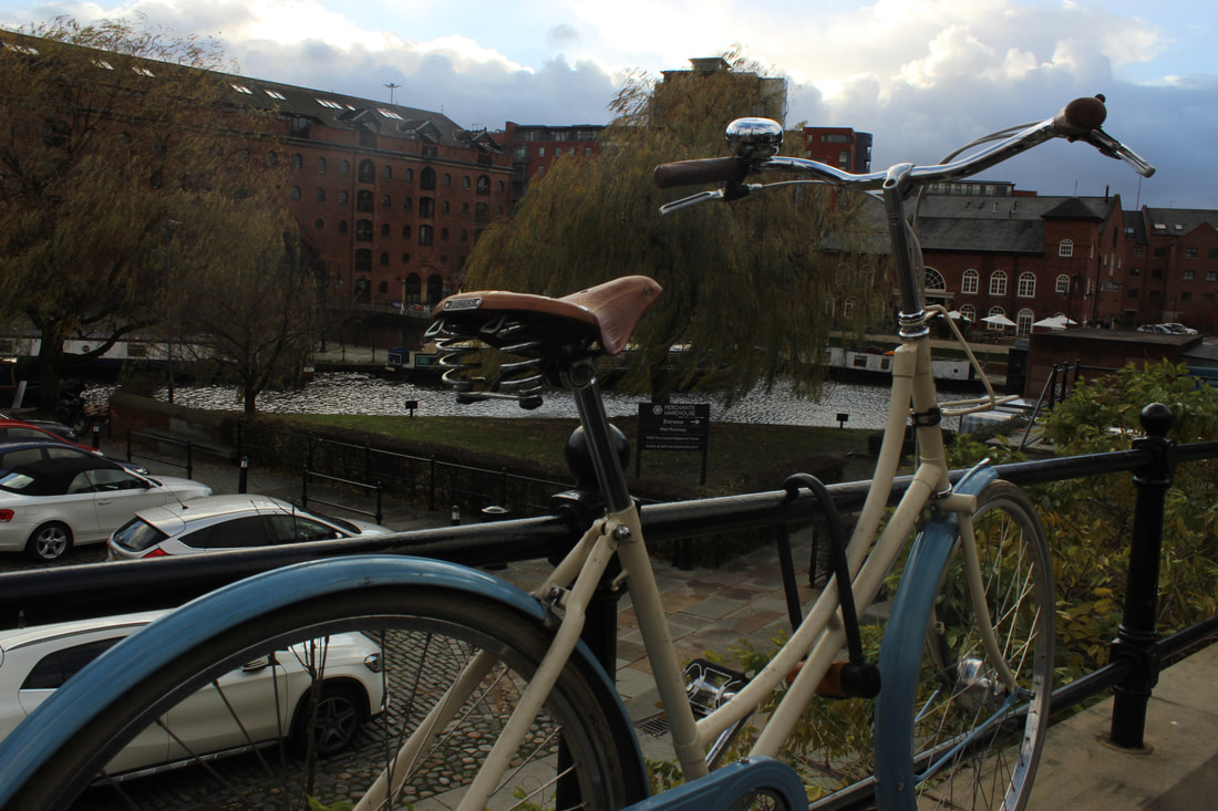
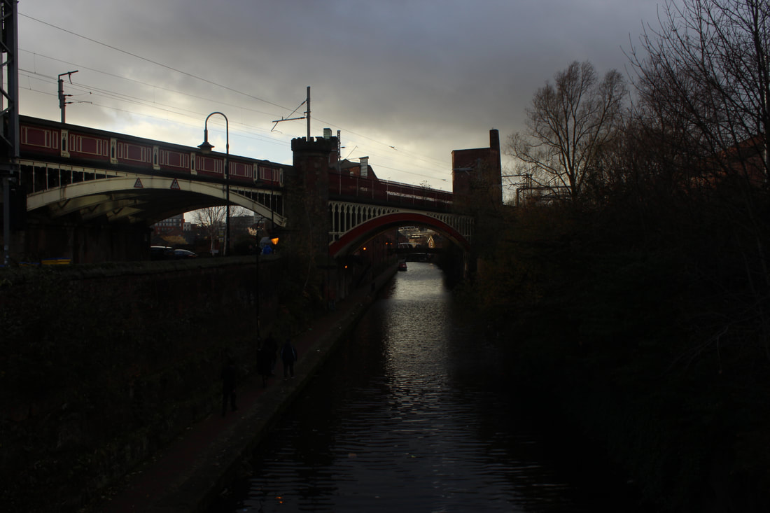
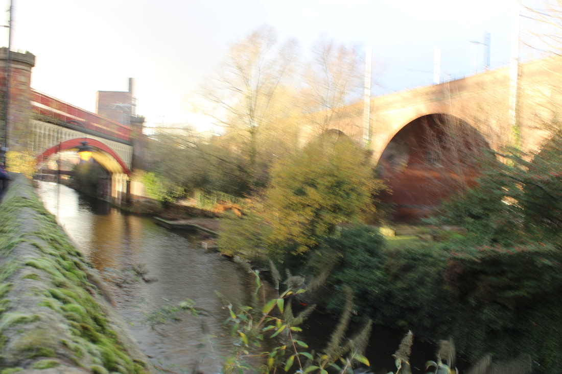
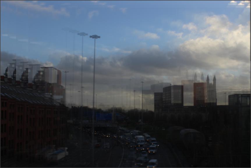
Manchester
On Friday we went down to City Centre in Manchester
via tram to capture the modern lifestyles and rainy weather of Manchester
Our Journey
Bridges


Best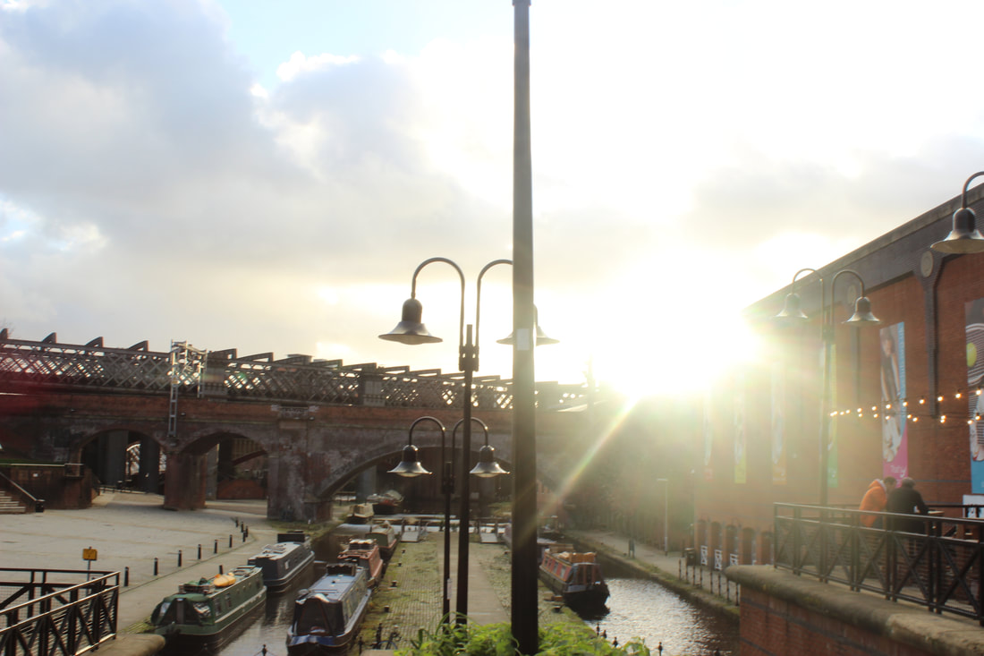
I like this picture because the sun is shining in to the camera and the building is also showing in the background.
|
Worst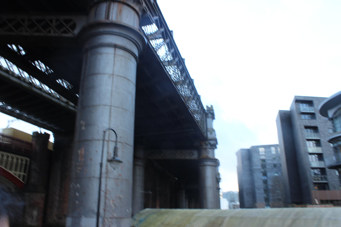
I don't like this because because it's blurry and it's not very clear but also because it is showing nothing as it is not angled correctly.
|
Building


Best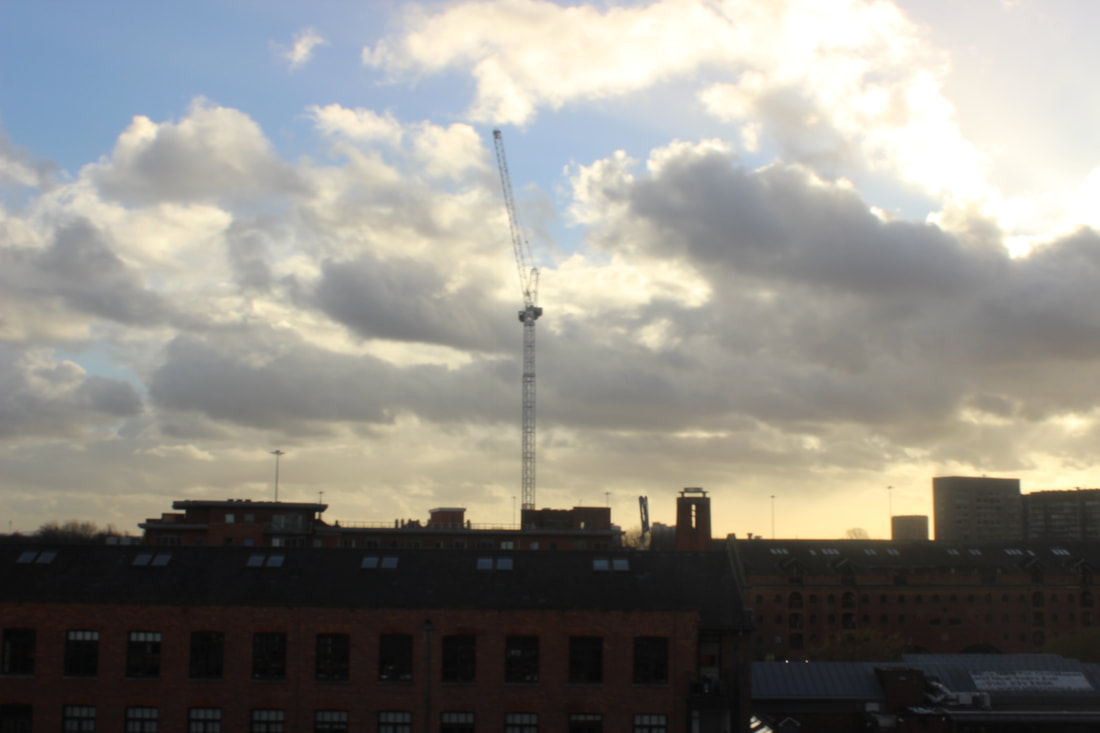
Out of many, I chose this picture because the sun setting is making the building have a blackened out effect which makes the picture nice.
|
Worst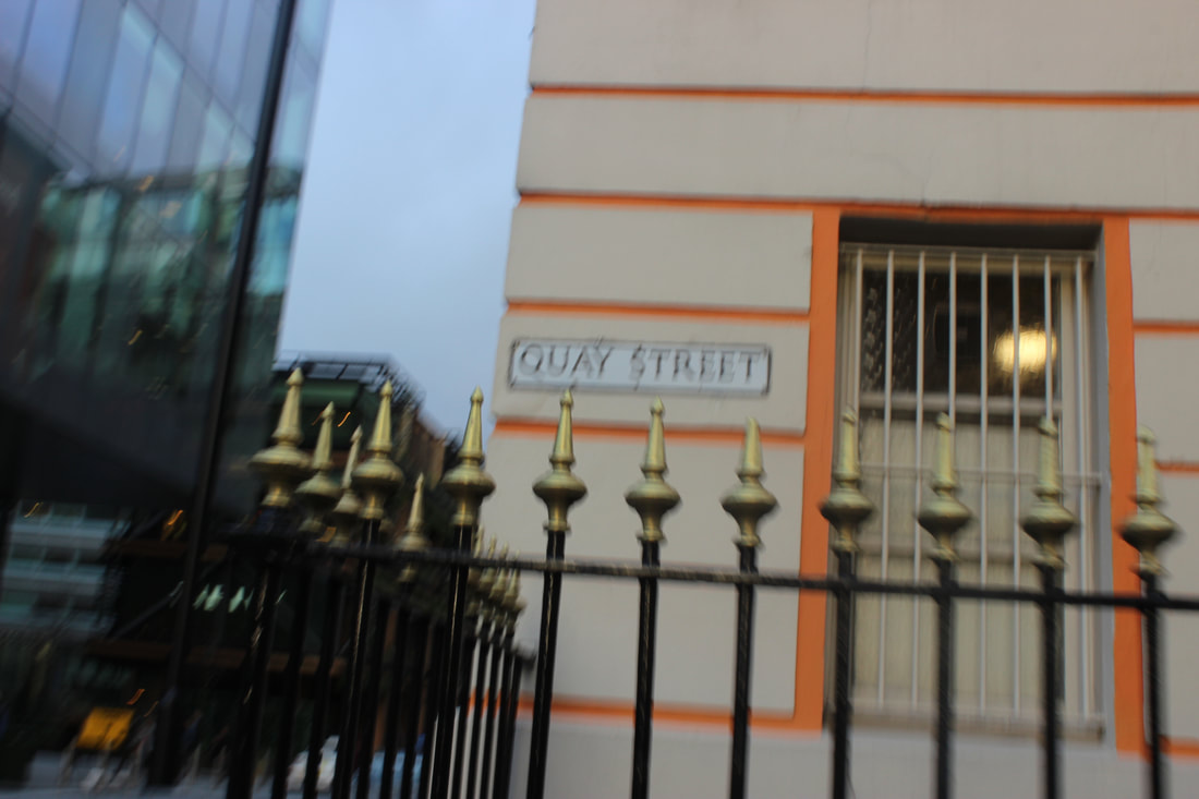
I don't like this picture because it doesn't show much and it is quite blurry other than that this picture isn't very exposing and it's not taken right.
|
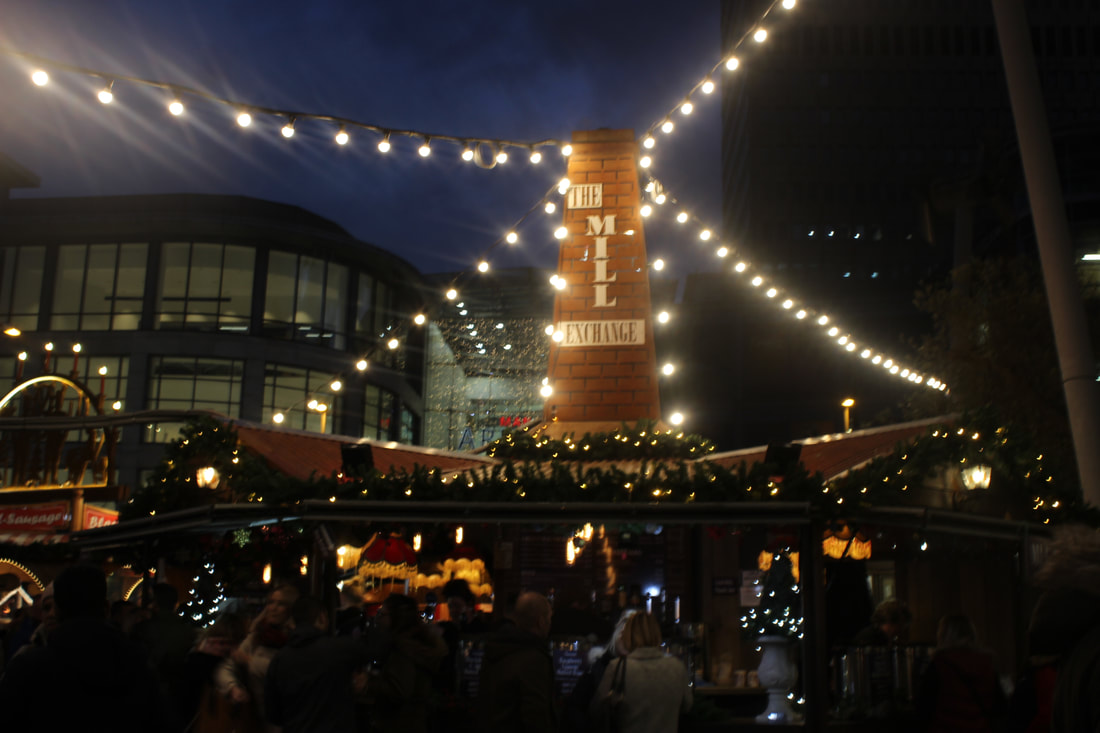
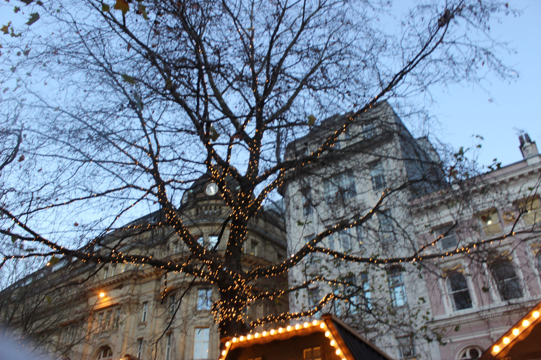
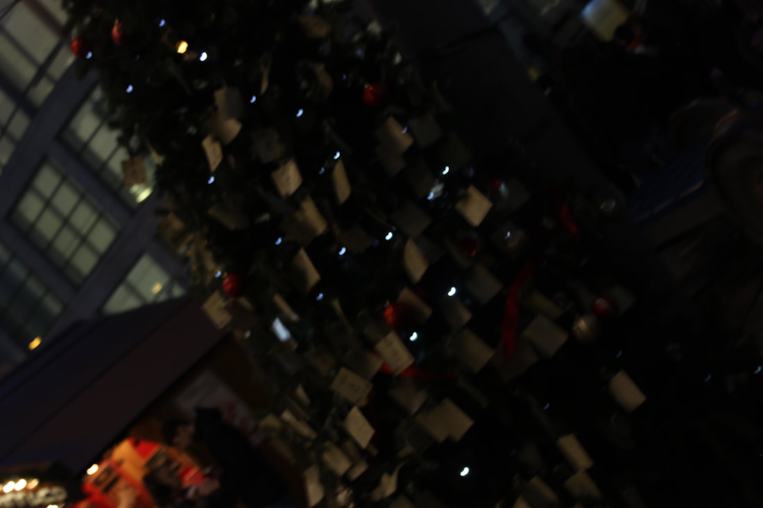
Christmas Market


Best |
Worst |
|
|
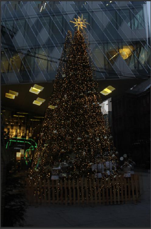
Christmas trees & Lights


Best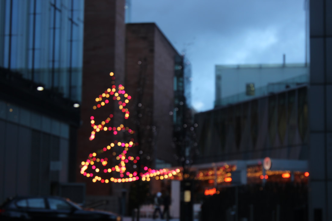
|
Worst
|
John Ryland's Library


Best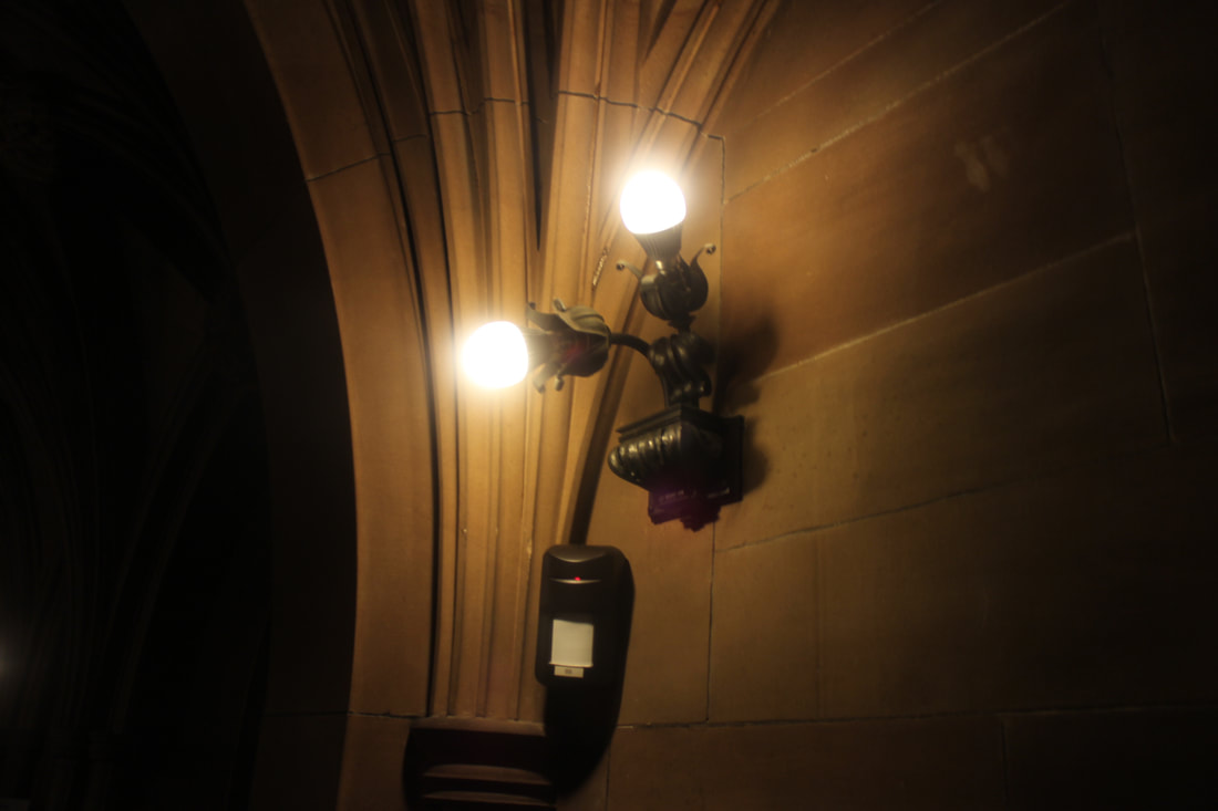
Out of all pictures, I liked this one because I feel that this picture just shows that darkness can be lightened up and it just has so much meaning behind it.
|
Worst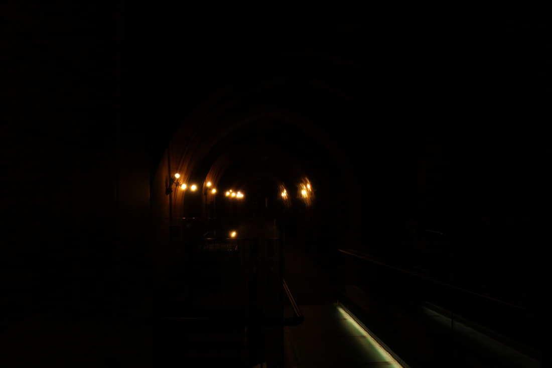
|
Royal Exchange Theater


Best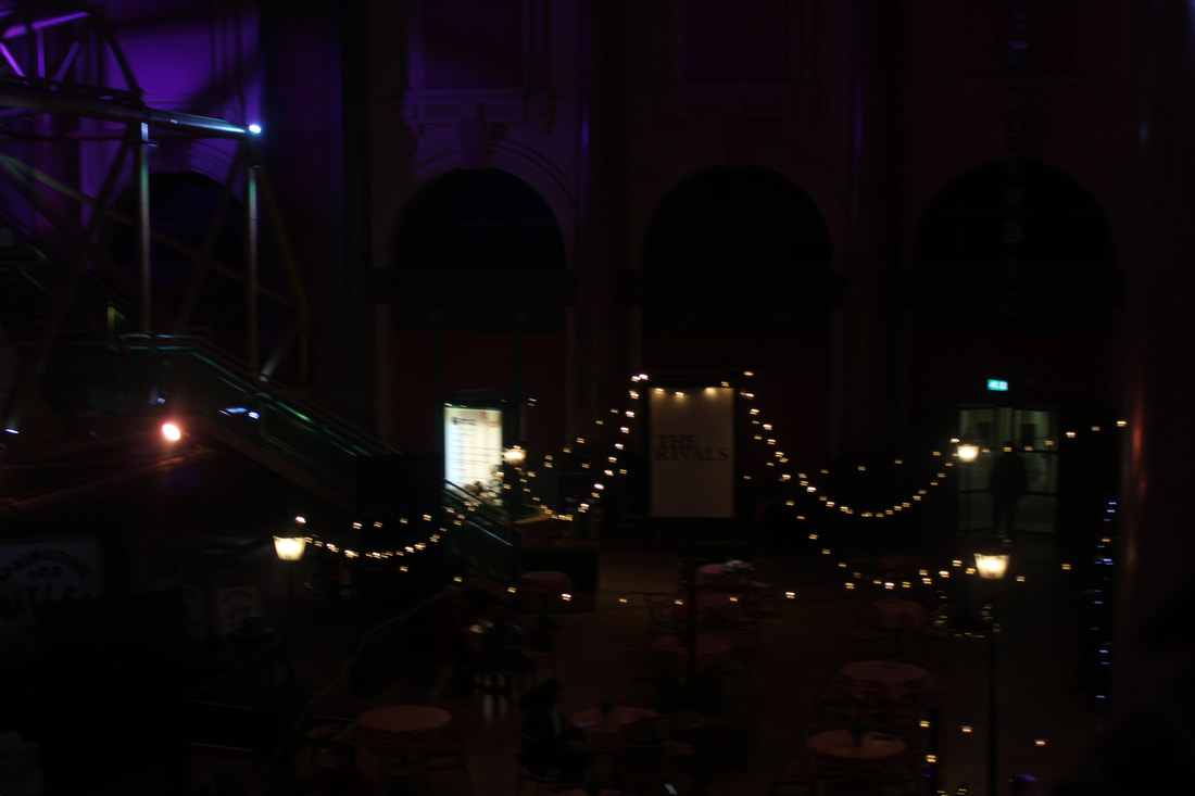
|
Worst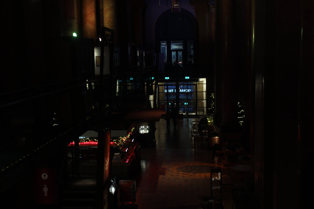
|
Seating


Best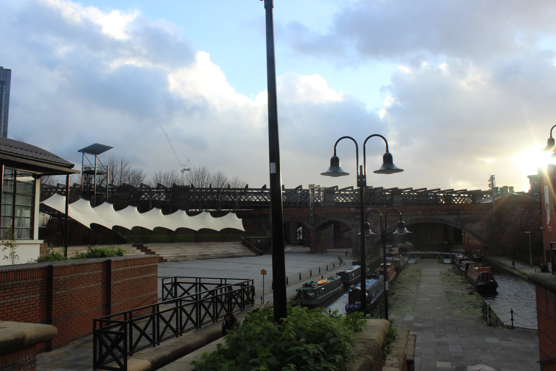
|
Worst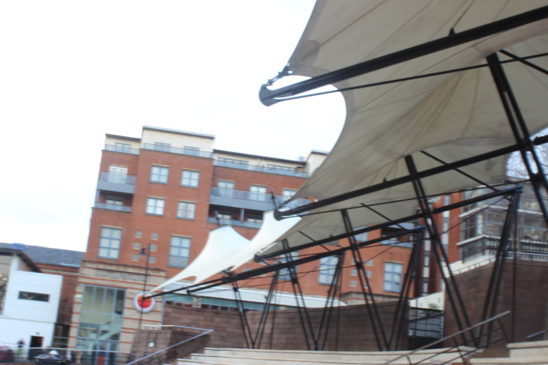
|
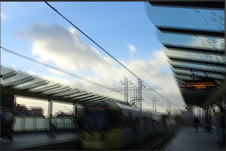
Tram Stops


Best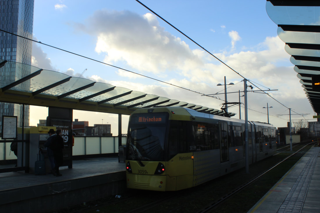
|
Worst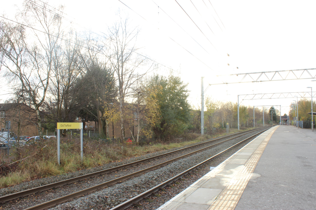
|
Transport


Best |
Worst |
|
|
Trees and Parks


Best
|
Worst
I don't like this picture because it is too blurry and nothing is being shown and there is no eye focus that is supposed to be in the picture.
|
Water


Best |
Worst |
I like this picture because the sunlight reflects down to the river and I think that it looks nice. The picture is a bit darkened out too so that makes it look different too.
|
This picture is blurred out and it looks like it's been taken while the camera was moving. In my opinion this picture could have been better. Aperture, angle etc.
|
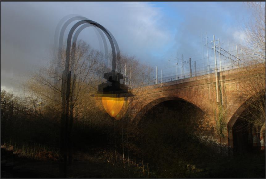
Photoshop 1
For this Photoshop, I was inspired by Leegan Rooster


Photoshop 2
For this Photoshop, I was inspired by Leegan Rooster


Photoshop 3


Photoshop 4


Photoshop 5


Photoshop 6


Photoshop 7


Photoshop 8


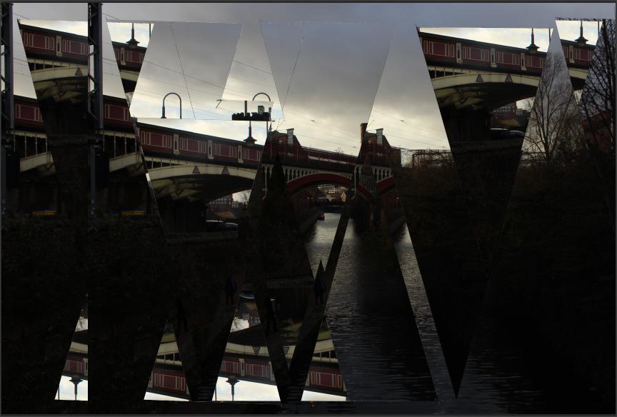
Final Outcomes
These are all the Photoshop that I have done for
Anglesey, London and Manchester together.


Evaluation
My project theme was Landscapes and I thought that this project was very different and interesting. I say this because I feel like this project let me explore more places outside of Manchester and it let me go out of my social circle to communicate with other people. This project took quite some time because we visited different places such as London and Anglesey to explore the different cultures and social activities that people do or visit to communicate with other. I enjoyed visited different places around Manchester the most because I felt like this allowed me to explore the different places and learn new things as well as developing my knowledge on how to take picture in the different environment which differ from each lightning and white balance.I would like the learn to adjust the camera to a more deeper extent. For example, when I am taking a picture in the dark to capture on piece of lightning I am unable to adjust the camera to focus on a specific light and make sure it is clear. I would like to learn how to change the camera to a deeper extent so that in the future I am able to take an accurate picture without the help of anyone else.
Throughout this project I research a variety of different photographers for different parts of the project for example, choosing different photographers to compare my work with such as Rudolf T and Kenneth Powell. For my final outcomes I have used other photographer such as Idris Khan and Thomas Struth to help me compare my work and develop my work. They have influenced my work by inspiring me to move forward and having a goal for my picture that I would want to exceed if possible which I feel that I have. Although my final outcomes are quite similar, I feel that they have that one similarity which makes them come together as a theme which is the cut out triangles. I enjoyed this technique because I felt like it made my work stand out as a whole and it made it different from other work that I have seen. For example, when people do this specific technique in photoshop, they tend to do each picture different so that they express the different ways that a shape can be cut out a manipulated throughout the picture however I have done the exact opposite and kept my images all nearly the same to differentiate from the norms.
I found that taking pictures was more successful for me because I felt like I personally done better in that than I did on my final outcomes and my project itself. I think this because my way of taking a picture was quite interesting in a way that I had to have my perfect lighting and aperture and I am aware of how to work a camera to see is anything needed to be changed to adjust to the theme of my picture of the main focus of the picture.I encountered multiple problems on photoshop for example, running out of ideas or not knowing how to photoshop something but I did not encounter any major problems that could not have been dealt with or that determined my projects ending. From the minor help that I got in photoshop, I learn how to apply them to my work independently and I managed to do it myself without the help anymore and this concluded in me applying this new technique to other outcomes when needed. If I was given the chance to do my project again, I would take extra care of my timing to complete anything that needed to be and produce my work to a higher standard fro example, I feel that I could have picked a better theme if I have taken time into consideration and developed more advanced final outcomes that would push me to a higher grade. My project does not not have any faults and everything that is uploaded is to help me achieve the highest mark possible.
