"We take photos as a return ticket to a moment otherwise gone"
STATEMENT OF INTENT
For this project I am aiming to create something wonderful but unique,this is because weird and wonderful consists of something that's not categorised into the social norms of society.I think this is a great project because it will be something different from my other ones considering that it won't be something that you see everyday. To exceed my knowledge of weird and wonderful I am researching a Japanese photographer called Naoya Hatakeyama and a German photographer called Anja Stieglar who have quite common work which is why I decided to choose two people who produce the same work to inspire me as I have a the same idea in mind. My theme is to use mirrors & reflection but also a good background to the image like Anja Stieglar who has used different background and themes to make her work look dissimilar.
To prosper ahead in my work I pursue to use props such as mirrors, water and a model to demonstrate my understanding of this project. I will use a wide range of different locations but prefer it to be a bright day so my pictures will have more effect. I would be more partial if I had a green background such as trees, plants or grass but however may need a dark night background too for some pictures. In my pictures water will be used to sprinkle some on the mirror so I can get similar images to Naoya Hatakeyama but also will get me a higher mark for not just only taking a mirror but developing my understanding with water. Another way to get my desired grade I will use photo-shop to make my images then fall into the category of weird, this will be done by photo-shopping my images to make them look fascinating and unique from direct images which show clearly what is happening however hopefully my images won't be as clear and will be complicating at first but will look quite professional. Finally I will have 8 weeks to accomplish this project and attain this distinctive project to my best ability and acquire a good grade.
To prosper ahead in my work I pursue to use props such as mirrors, water and a model to demonstrate my understanding of this project. I will use a wide range of different locations but prefer it to be a bright day so my pictures will have more effect. I would be more partial if I had a green background such as trees, plants or grass but however may need a dark night background too for some pictures. In my pictures water will be used to sprinkle some on the mirror so I can get similar images to Naoya Hatakeyama but also will get me a higher mark for not just only taking a mirror but developing my understanding with water. Another way to get my desired grade I will use photo-shop to make my images then fall into the category of weird, this will be done by photo-shopping my images to make them look fascinating and unique from direct images which show clearly what is happening however hopefully my images won't be as clear and will be complicating at first but will look quite professional. Finally I will have 8 weeks to accomplish this project and attain this distinctive project to my best ability and acquire a good grade.
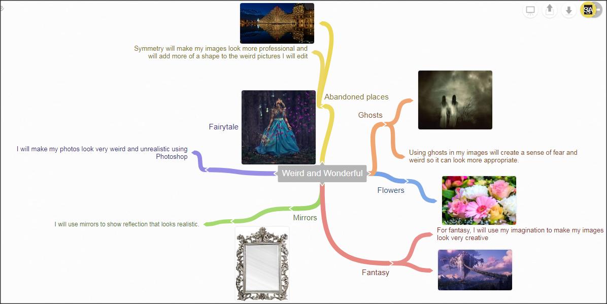
MINDMAP
MOODBOARD


SURREALISM
"Surrealism aimed to revolutionize human experiences, rejecting a rational vision of life in favor of one that asserted the value of the unconscious and dreams.The movements poet and artists found magic and strange beauty in the unexpected and the uncanny, the disregard and the unconventional"
This quote shows that surrealism is used to create a different perspective on something normal usually used to create a unusual perceptive.
This quote shows that surrealism is used to create a different perspective on something normal usually used to create a unusual perceptive.
HOMEWORK- Anaylsing artist research

|
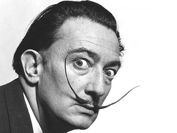
For my artistic research I chose to look at a piece done by a famous Spanish artist named Salvador Dali. His work is prominent for being weird and full of concept, one example of his work is this one which is showing a clock melting away in the sea on the bottom right corner. There is a sharp contrast between the blue sky and the edge of the brown cube and between the clock and the other edge of the cube which makes the photo look very influential. The artists has used a wide range of colours depending on what object he has chose to paint in the picture, making it look very professional and to catch the viewers eye, the artist has made the objects very eye catching by using bright and dull colours such as gold for the clock which catches the viewers attention first before noticing the sea and that the cloth is melting. In my opinion this picture is uncanny because it looks very realistic like it's a dream. Personally I don't like the idea of Salvador Dali painting pictures that people have unconscious thoughts of, I think it is very improper and unethical.
|
Artist research-Rene Magritte

|
Form-This means looking at the formal elements of an artwork.
In this picture, Rene has used a maximum of three colors to keep the picture simple but effective. He has used light blue for the sky, dark green for the grass, white for the outline of the newspaper and black for the body of the man.In my opinion I think the artist has done this to show the contract between all four colors in the picture. The artist has used oil paint or acrylic paint to create the picture as what it is. The colours used shows how the artist has wanted to show different perspectives of the image; some as good and some as bad. |
There aren't many shapes used in the painting however the shapes are quite unique from each other such as the rectangles for the newspaper and the portrait itself but also the tree shape which has been used all across the painting. The surface is smooth until the trees come in the painting which gives the painting more depth and it almost seems as if its 3D. The image is an average size painting which makes it easier fore the viewer to analyse the painting and can tell what is happening and how. From a computer screen the texture of the image is not very clear however if I was to see this picture in a gallery or in person I would be sure that it would have some texture which I would be able to analyse.
Context-This refers to how the work relates to a particular time, place culture and society in which it was produced.
Context-This refers to how the work relates to a particular time, place culture and society in which it was produced.
1st Photographer-Anja Stiegler
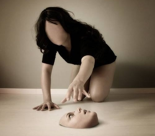
Context-This picture looks like its been taken in a photo studio and was intentionally created to show a deep meaning. This is showing a women who's face is further away from her, her senses are not with her as all of them are on the floor except touch. Looking at her face that's on the floor I can tell that she's worried that she's lost her face. In my opinion I think the meaning behind this photo is to show the inside of how a person is feeling when they are alone. I think this because she makes her work look very different compared to other work and to find out what the image is trying to show, you need to concentrate on why it's happening rather than whats happening. The photographers reason for taking it could be that shes's trying to show peoples emotions and feelings in photos instead of just describing them.
Content-In the image the women is trying to grab her face back after it has come off from her head. This photo looks confusing at first but eventually the person viewing the picture can tell what's happening in the picture. The women is quite lost and worried as she doesn't have her eyes to see the picture or doesn't have her mouth to ask for help. I can tell by just looking at the picture that it is photo-shopped but the main point is what the photographer is trying to show us which is the women who is feeling quite alone suggesting that none of her senses are with her confusing her and upsetting her.
Comment-I don't like this picture because it doesn't have a clear meaning to it, there could have been more to show people who are viewing this picture. Personally I think this picture shows less than it could have and if there is another meaning then it should have been shown more clearer for the viewer. The strength are that the photographer has used the right aperture so it's not too light but not dark.
Composition-I think the photographer has used a slow aperture so that the picture can be seen but kept the background quite neutral so that it has more of an effect on the person viewing it. I also think the theme is kept neutral so that it can attract the viewers attention and stand out from other pictures only because other photographer tend to use black or grey to show darkness but this photographer has used a different colour which makes the viewer more interested.
Connection-It links to my work because it's not something that's very realistic and seeing a women with no face isn't something you would expect to see everyday. This categorizes the picture under weird and wonderful because its quite weird but not in a bad way, making it "weird and wonderful"I think the meaning is quite powerless but if I was to choose a specific meaning it will be that the picture shows a persons feelings and emotions from the insides. The meaning does not link to my work in any way but however the picture of what she is doing links to my work more.

|

|

|


Outcome


2nd Photographer-Naoya Hatakeyama

Context-I don't think this photographer had an purpose behind taking this picture because it isn't a picture to tell us a lot about what's happening. However I think his pictures are taken coincidentally when he sees something he likes and decided to take a picture.The picture has been taken in Paris in front of the Eiffel Tower and by the looks of the picture it was taken in the 21st century so recently. I know this because of the format of the picture and the high quality.
Content-In the image there is the Eiffel Tower at night with all the lights on and in front of it is a window full of teardrops because of the rain. The camera is mainly focused on the raindrops and the Eiffel Tower is blurred out in the background.
Comment-In my opinion I like this picture because it is different and not directly straight up view for the viewer but instead it's something that makes the reader think and understand on whats going on. In my opinion this picture is very unique and special because of the style of the picture. However one of the weakness is that it could be seen as too simple in other viewers as it's not much detailed as only the Eiffel Tower is seen in the foreground,center and background which may be boring according to some viewers.Everyone has different views but in my opinion I like the idea of it being different and using minor things such as rain to make a photography memorable.
Composition-The image is surrounded by the Eiffel Tower in the center and background however in the foreground there are the raindrops and the blurred out Eiffel Tower. The lighting is quite dark because its night time when the picture was taken however lighting on the Eiffel Tower change the white balance of the picture as it makes it more bright and stand out.The photo has been taken at a right angle of the Eiffel Tower which shows the depth of the tower itself. Composition of the picture is the Eiffel Tower being in the middle/center, which is very good as that is the main attraction for the viewer and it catches the viewers eye.
Connections-This photo does not directly link to my work but however it does reach the minimum requirements in order to take a good picture which is the only way it is linked to my project.


Phootshoot Plan 1
Photoshoot Plan 2
Photoshoot Plan 3
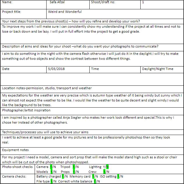
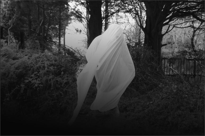
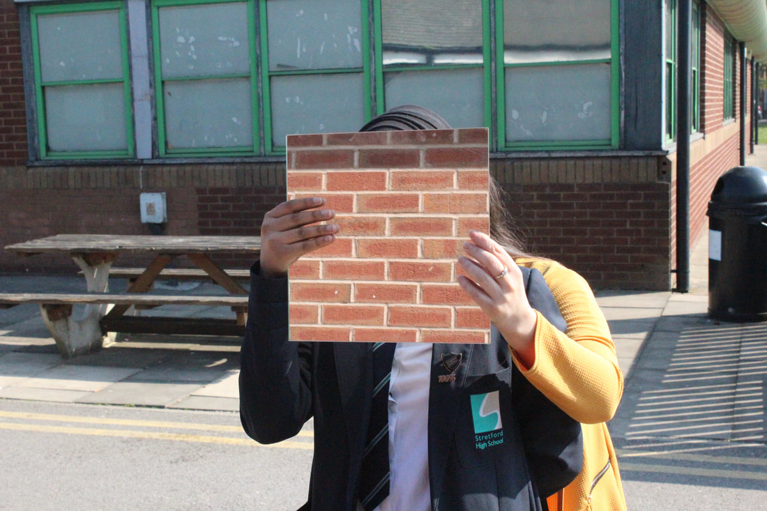
Longford Park- Shoot 1


Best |
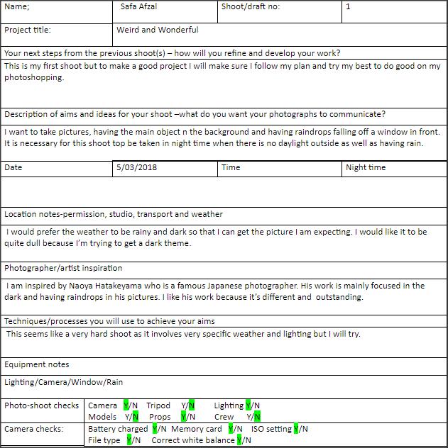
Worst |
I like this because the camera focus on the branch and the ghost is unfocused in the background which makes it look more terrifying but realistic. However the photo would have been better if the ghost was a bit more visible for example in the center.
|
I don't like this picture because you can see the hidden figure which is not supposed to be seen. This makes the Photoshop much more difficult and harder. I think the figure should have been hidden so I could have hidden the chair so it looked like levitation has been taken place.
|
Photoshop-Ducklink 1


Final Image
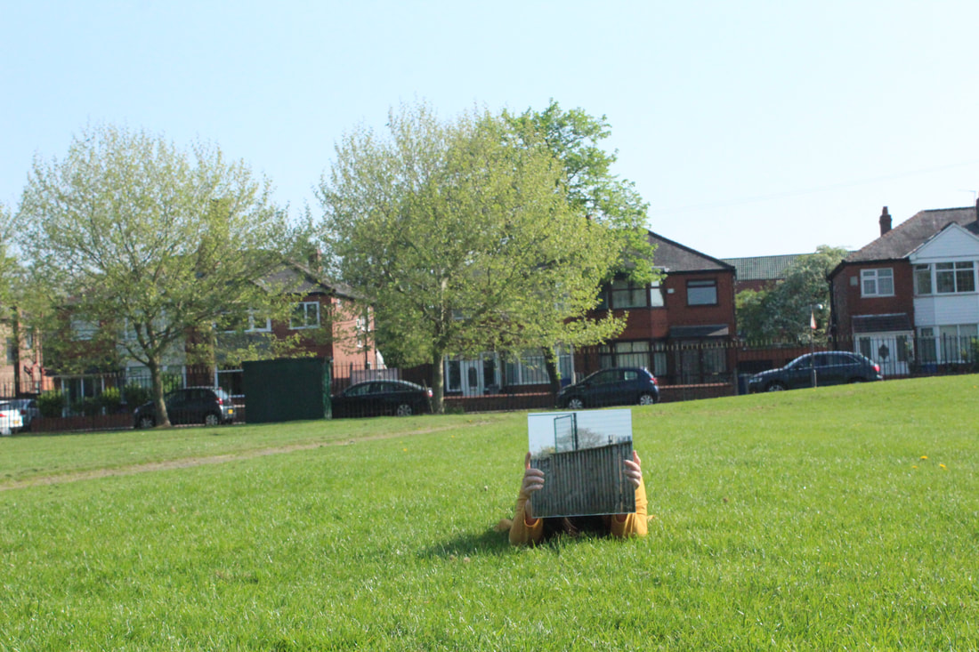
Longford Park-Shoot 2


Photoshop-Ducklinks


Final Image

LINKING PARAGRAPH
For my weird and wonderful portfolio I went to Longford Park to take pictures which I then photo shopped to make it fit under the category of weird and wonderful. In Longford park I had a lot of space and a lot of "mystical" areas from where I could have taken top quality pictures. However in school there was only a bright atmosphere and lighting directly entering the lens from the sun. I think for this project Longford Park was better than school because there was less light entering the lens and there was more space and more variety of backgrounds. In school I would often need to talk photos with only building in the background.
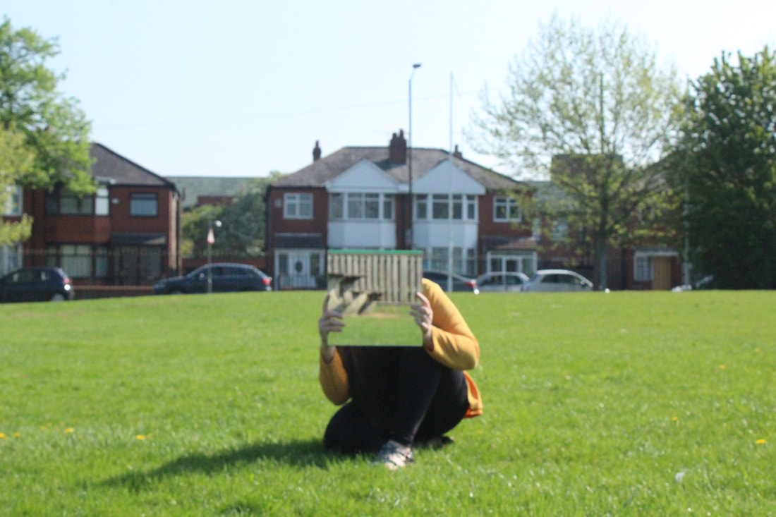
Shoot 3


Best |
Worst |
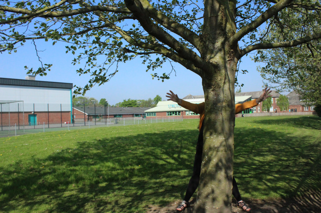
I like this because it shows the model's arms and lags surrounding the tree making it seem lie its the tree who has the arms and legs. This can look like a professional picture after Photoshop has been used to define the picture more.
|
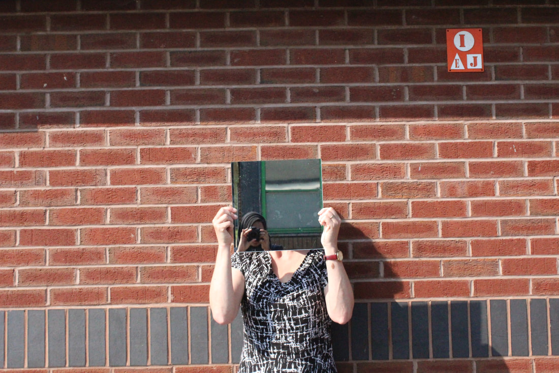
I don't like this because there isn't really anything to see in this expect two pair of fingers and a mirror and hardly a body holding the mirror. I think if this picture was to be worked with Photoshop it still would be quite useless because of the picture itself.
|
Photoshop-Ducklink 2


Final image


Shoot 4


Best |
Worst |
I like this because the even though there are different hands but it looks like the same person and it looks very different to what I have done before.
|
I don't like this because there is not much this picture is showing and it could have been better.
|
Photoshop-Ducklink 3


Final Image

In this Photoshop, I have used the black paint brush tool to blacken out the background and make the main attraction stand out. To do this I had to zoom in and out of the picture to make sure I am not leaving any gaps between the person and the background.
Final Gallery


Evaluation
Over the course of photography, I have learnt a wide range of skills from the use of the camera to using Photoshop. In this part of my course I choose to create a portfolio based on my chosen theme of mirrors in Weird and Wonderful. In my opinion the project was very exciting as I had something new to work on every lesson and I was able to effectively develop my ideas through creative and purposeful research.I think that the project itself was very unique and uncommon and it was a new experience for me as now I have had the experience of making my images so different by using Photoshop.
I enjoyed taking pictures by dressing up models and the background and making my models look unusual, However photo shopping the pictures to create a remarkable effect was also very intriguing because it wouldn't be something that is seen daily for a person looking at the images.
I learnt a variety of new techniques during this project to take and refine my pictures. 3One of the main techniques I experienced was Photoshop in order to develop my images to a higher standard. I grew confidence by continuously using Photoshop as before this project, I wasn't aware of the endless possibilities that you could have, however now I can successfully use it to improve my work and bring my ideas to life.
I would like to develop further in competently presenting a personal, and meaningful response with confidence and conviction when creating my final portfolio and linking it to my chosen artist. I will allow myself to do this by spending more time on the quality of my work instead of quantity and I will present my work to a high standard which will also allow me to gain knowledge for further experiences.
I feel that I was able to group my images and organised them in a adequate way allowing me to further extend my knowledge and be able to effectively demonstrate my understanding. I think this because organizing a ground of random images forces me to think of different categories which are appropriate and understandable not only for me but for everyone else who will look through my project.
Overall in my project, I did not encounter with any major problems but however thinking and producing different shoots and themes was quite difficult as a lot of thinking and responsibility was required in order for it to be successful. But I managed to get through it all as I got the motivation and I completed my task to the best of my ability.
The lack of responsibility lead to incomplete work forcing me to spend extra time and effort to satisfy myself.
This concluded in me learning that responsibility is key when taking a hold of a new project and managing it yourself and ensuring that you manage time well and that all the work is completed to a high standard and on time. This affected my final print because I did not have enough pictures from which I could say that I learnt something new and improved from before.
Next time if this project would be given I would take time out and make sure that I have completed each and every task to the best of my ability and I would pay more attention to how the image can be photoshop to be categorized as weird and wonderful.I will do this by planning out my project and sticking to my plan which will make my work improve and get me better grades.
